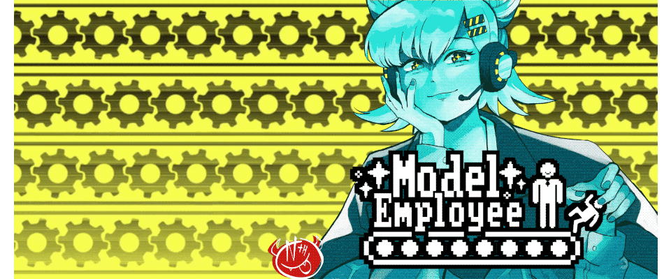
Model Employee
A Postmortem on Model Employee
With Spooktober behind us and the team back together, we’d like to one again formally thank all the players, readers, streamers, friends and fans who’ve enjoyed Model Employee. Seeing your reactions, reading your comments, and gawking at your fanart has been the greatest reward we could’ve asked for- Though we’re also pretty proud to have won the Grand Prize after being chosen as Judge’s Favorite. Our heartfelt thanks go out to the entire DevTalk community for their warm reception and enthusiasm for the story we wanted to tell <3
To provide our fans and our peers a peek behind the curtain, and show how we made this game in just 30 short days, we’d like to give a Postmortem on the production of Model Employee.
Planning
Making a game takes a lot of effort- and for every ounce of individual effort put in, you need to spend at least that much on working together. So before we got to work on any kind of asset creation, we did as much planning as possible.
The initial concept for Model Employee came from an idea for a short story; it was a short, sad, near-future morality tale about a down-on-his luck job-searcher who abandons hope of finding meaningful work to take an opening position at the latest and greatest megastore in town. Not long after starting there, he makes enough mistakes that his job security becomes uncertain, and in a moment of panic he lashes out at the only friendly face among his coworkers… only for the electronic monitoring system to reward him for his anti-social behavior.
With Spooktober and Halloween approaching, the idea seemed like it could work well as a horror story- so long as a few dials were twisted. The near-future department store became a cyberpunk mega-warehouse, labyrinthian and seemingly infinite. Bad workplace behavior became full-on murder, and the dispassionate electronic overseer was re-worked into a much more entertaining antagonist- Penny.
While the initial premise for Model Employee works well enough on it own, it was important that we made changes early-on to help it better fit into the unique mold of the Visual Novel medium. Penny would be given a much more active role in the story and constant presence in the game's user interface, letting her toy with certain preconceptions we knew our readers would bring into the experience. The cast was expanded and the "Workplace Incidents" were spaced further apart (to allow for a slower, more sinister corruption of the protagonist and their morals), and choices (some of them false) were introduced to sell the story’s themes of helplessness, corporate cruelty, and loss of autonomy. Altogether these changes took Model Employee from a fun idea to a genuinely disturbing, incredibly memorable visual novel experience- though we never ended up changing the title.
Due to certain scheduling conflicts early in the month we knew we wouldn’t be able to start asset creation in earnest right away so we instead used this time to plan, iterate, bounce ideas off of each other and talk.
"Our collaborative process was... done online via discord with occasional meetings to keep things on track. While I was new to this process, I felt like we created a system that worked well and allowed each artist to contribute in their own ways! For me there was a lingering sense of dread due to style clash ( my drawing influence comes mostly from western cartoons and animation) but with the Team behind me I was able to get over that and submit some designs that I was really proud of and that made it into the final version!"
-mistahmihaich, Concept/ Line Artist
During these conversations, we highlighted a few key challenges that we’d need to keep in mind as we began work- the biggest of them being time constraints. 30 days is not a long time, even for professionals working fulltime. For a small team of indie artists like ourselves, we needed to take every shortcut we could find- So instead of HD graphics, we opted for a low-fi, retro-futuristic art style and presentation, inspired by the PC-98 era of visual novels. To match that aesthetic, we wanted a more squarish aspect ratio that still had modern sensibilities, so we designed a large, obtrusive UI to cover up much of the screen and keep the characters and backgrounds tightly bound to center-screen- which also made the whole game feel more claustrophobic. Planning for such a complex main UI then left us plenty of room down the line to mess with it during the story… but more on that later.
"Being a part of, but not the sole contributor to a project was awesome, and I found myself really enjoying the position I was in after the initial design work. Exploring new drawing styles was initially daunting but ultimately rewarding, and in many ways helped me to grow as an artist as well."
- mistahmihaich, Concept/ Line Artist
Character Art
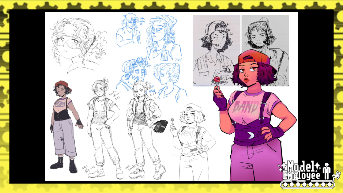
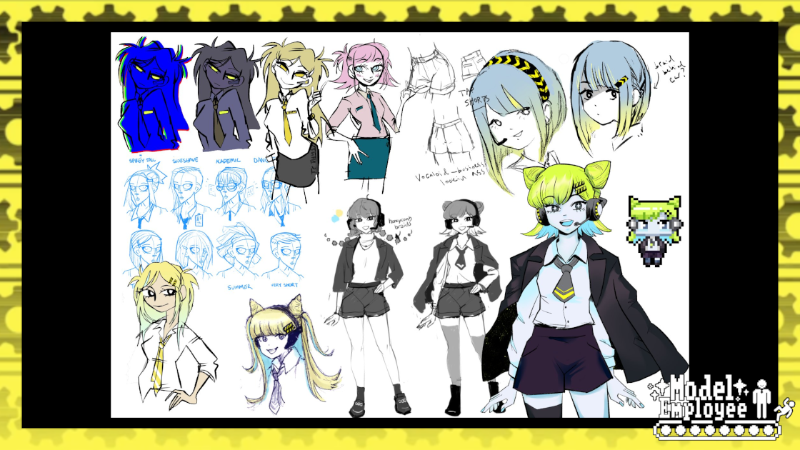
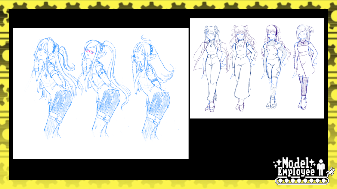
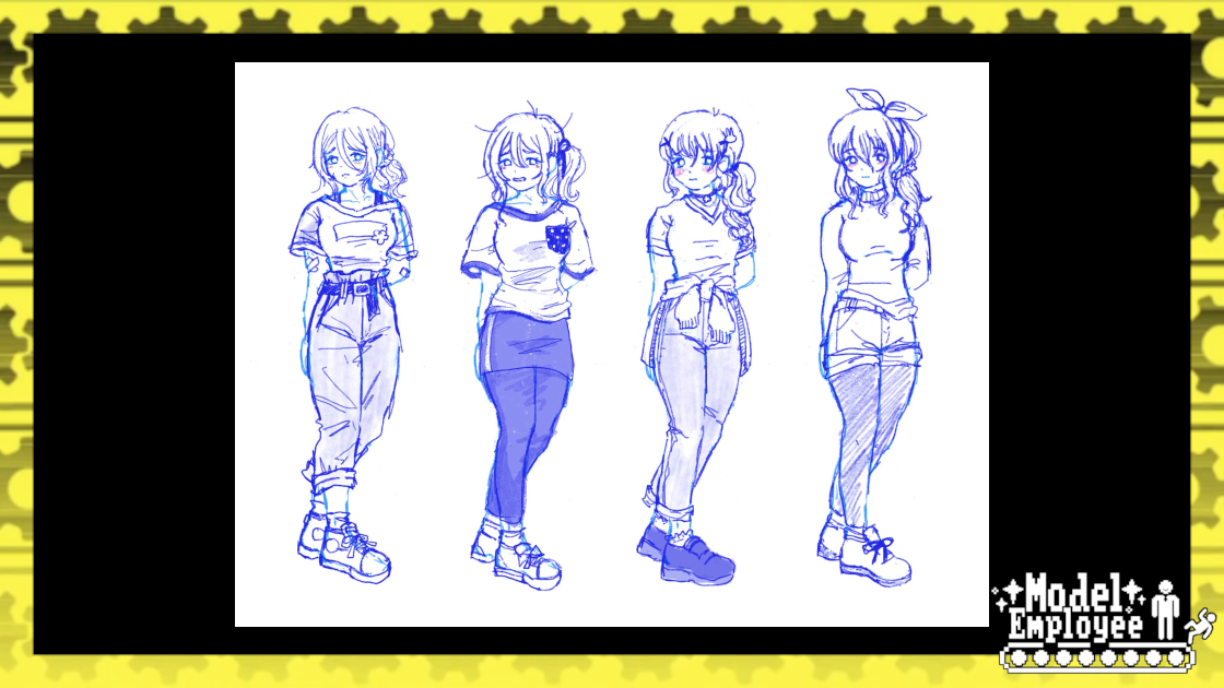
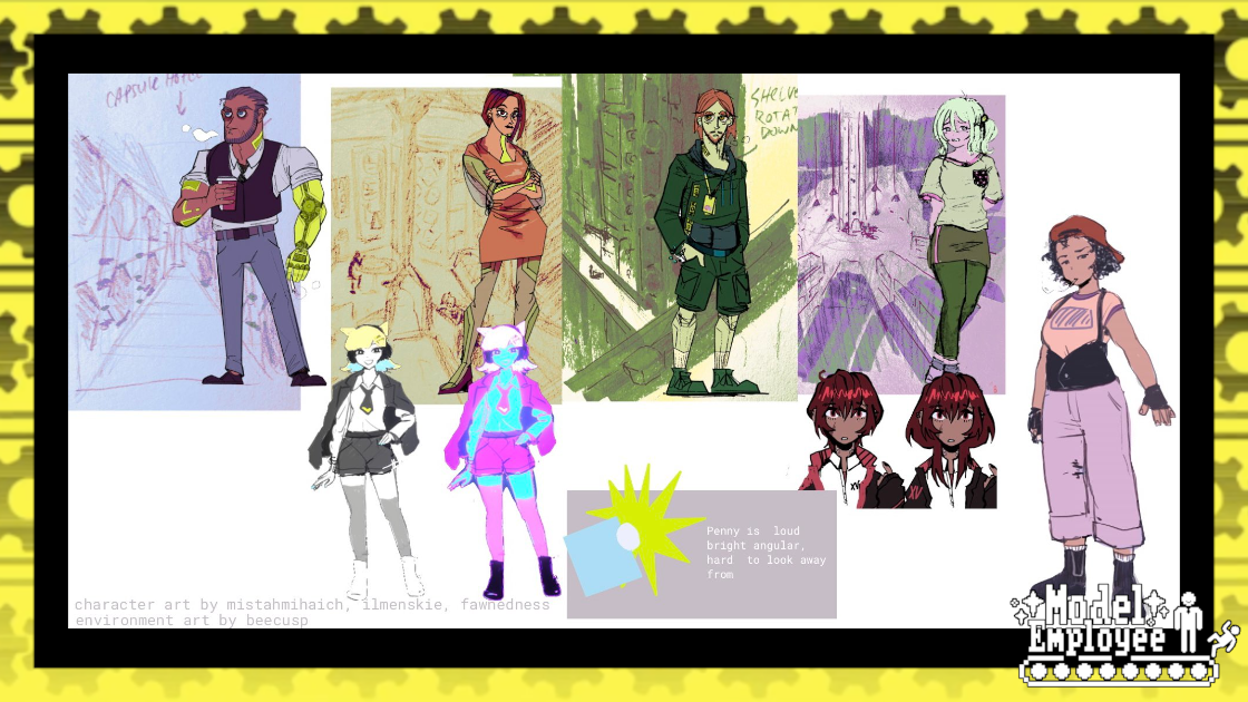
With our art style set and our cast’s roles defined, we started to work on character design iterations. This was a collaborative process where team members, whether they were artists or not, weighed in on each other’s ideas as we strived for designs that read cleanly, felt distinct, and looked like the all belonged to the same setting.
"Being my first Jam with Nth Circle, I saw an opportunity to immerse myself in the design process of the various characters of ME, and really get involved in the Jam. Designing in this collaborative way proved to be a huge benefit for me early on, as aspects of the design that resonated would get vocal reactions in our discord channels and guide the drawings towards something we all liked. It was also great to have folks who can keep everything stylistically consistent. Props to our team of directors who were always online to offer some insight."
-mistahmihaich, Concept/ Line Artist
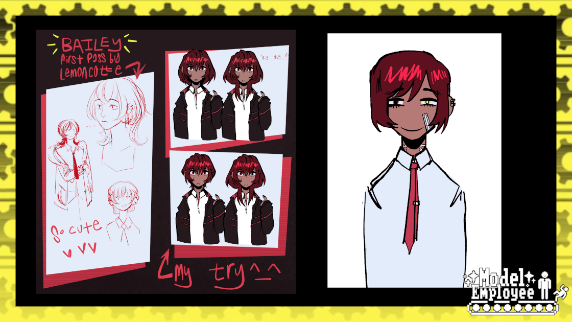
Early on in the design phase we would focus on a character's role in the story, rather than their individual personality or history. If we knew a character needed to be a jerk, or a slacker, or a sympathetic face, we’d start from there and work our way backwards towards a more nuanced persona. Initial sketches were handled by ilmenskie, and line art was done by mistahmihaich. Art Director Evillittlebug handled coloring, and then each sprite was scaled to their proper in-game height, after which dithering was added.
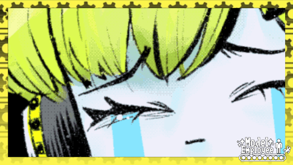
Dithering is a process by which swatches of color in an image are “speckled” by pixels of other shades in order to create the appearance of a wide, even gradient without actually using that many different colors in the image. During the PC-98 era, this was a necessary trick in order to produce vivid images within the bounds of limited file sizes and screen resolutions, so we added dithering to our character sprites and background post-processing to recreate that retro feel (though we did cheat on the actual number of colors in most of the sprites themselves). To help sell the "illusion" of the dithered graphics, we avoided changing character's sizing or animating their movements during gameplay, so that any pixilation felt like it was a part of the player's screen and not just the images moving around on it.
"This is my second time collaborating with Nth Circle on a game jam, and in designing for both Kodokuhime and Model Employee, I’ve found that my particular approach with concept art is “cast a very wide net and see what resonates with the team.” I try not to get hung up on one particular idea and force myself to keep sketching, trying to keep each idea as ‘distinct’ as possible while still stemming from the same overall concept. I’m less of an illustrator compared to some of my teammates, but I use my background in fashion design to aide in the character design process and bring some different perspectives into the mix—I think a lot about how the character would express themselves through clothing (or, inversely, how the costume can reflect the nature of the character) and in combining those details with what’s practical/realistic for the setting, it forms a more solid base for ideas to branch off of."
- fawnedness, Concept/Pixel Artist
Once each member of the cast had their “base” sprite complete, the game script was scanned over and a list of each character’s total number of different emotional states was compiled. Any emotions that came up only once or twice or overlapped too much with each other were cut, and then descriptions of each were written for the art team. From there, redraws of their base sprites were made to fit each of these needed expressions, and then they were added to the game as the character’s “emotes.” While this meant that expression work couldn’t begin until after the script was mostly finalized, it saved the artists from spending any time on unnecessary sprite variations, netting the team more time as a whole.
Graphic Design

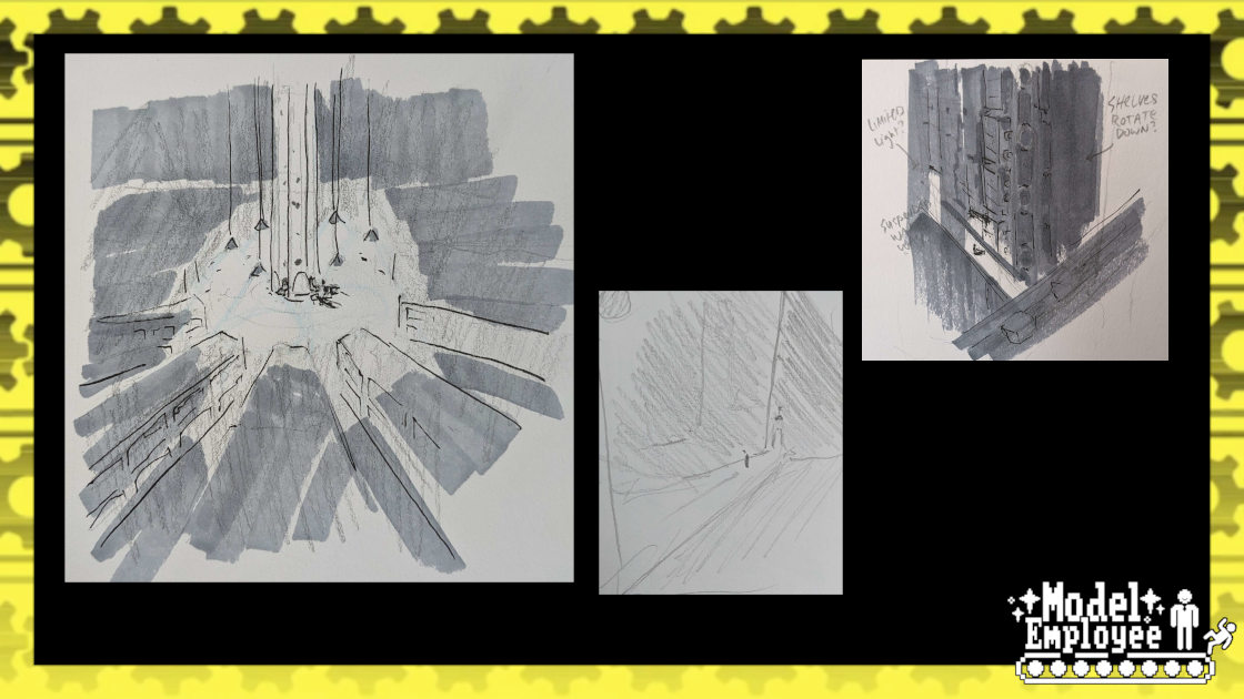
UI Designs was lead by team member manmunks, who drew upon various examples of PC-98 games and 90's computer systems. We started by drawing mock-ups of how the UI could fill out the necessary space on top of early alpha screenshots, and we toyed with various ideas like watches, calendars, a stock-index, or even meters that gauged how much affection the player had garnered with members of the cast. Throughout this process, we always made sure that the player’s bank account was the most heavily emphasized number of screen, in order to reflect how heavily their debt weighed on the protagonists' mind. To underline this idea, we even ended up putting the player's balance on screen in two separate corners.
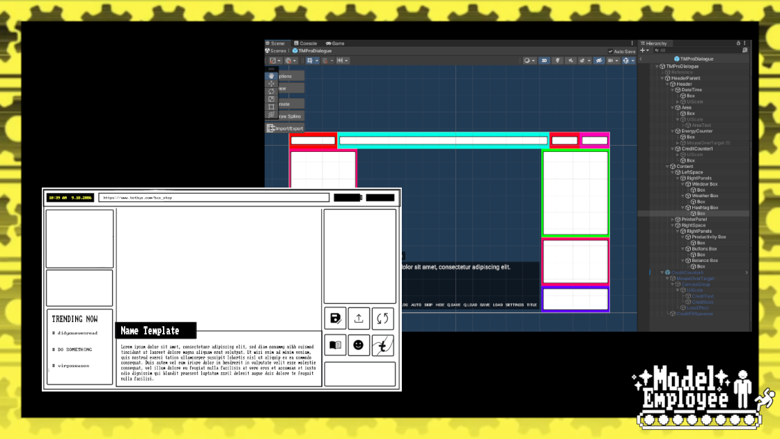
Once finalized, said design was then re-created in Unity as an overlay that sat in front of our characters and our backgrounds, framing them in the a smaller, tighter aspect ratio and providing additional atmosphere and world-building through features like a scrolling list of in-universe hashtags and a sensor monitoring the protagonist’s heart rate.
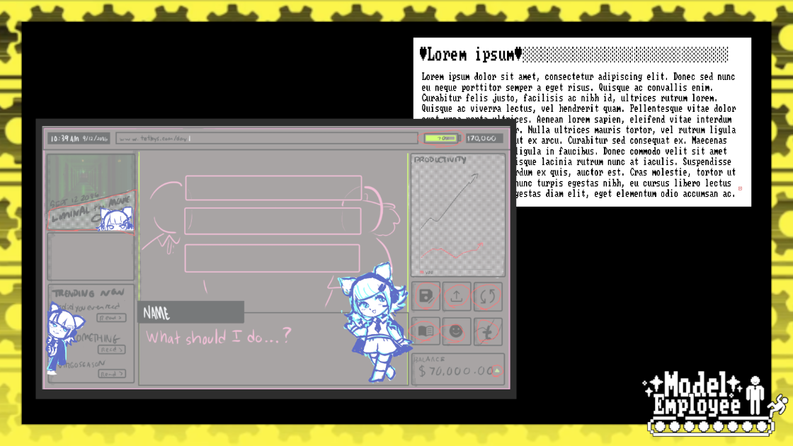
Our goal was for the initial state of the UI to be unappealing, cluttered, and even mildly hostile- this way, when Penny started to delete items from it, players would be grateful rather than suspicious. Just like the protagonist themselves, they would see Penny’s constant presence as a comfort compared to the harsh angles and constant noise of the corporate world… until she starts culling more and more of what she considers “unimportant,” until nothing remains but a number in a bank account.
CGs
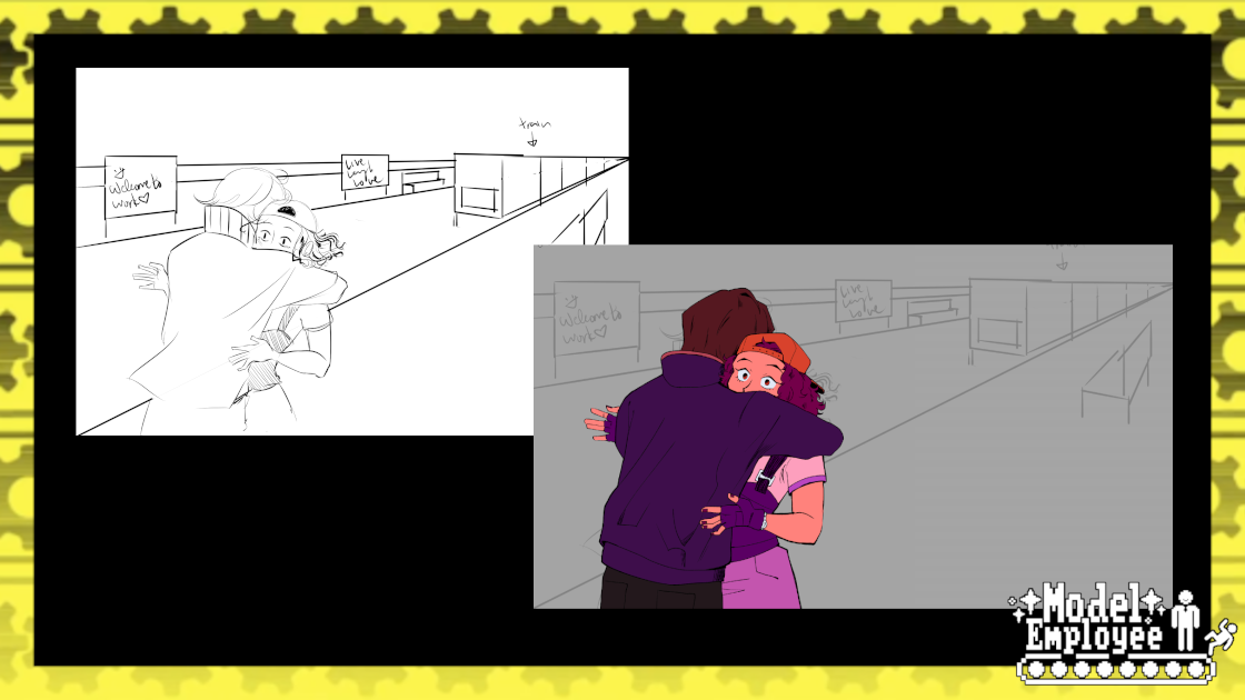
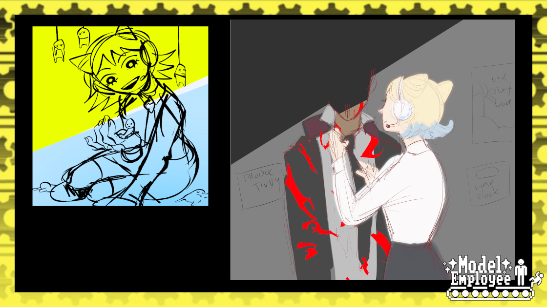
We knew from early on in planning that we wanted to utilize CGs for our most important story beats, but creating high-quality CGs is a time-consuming process that requires input from multiple team members at each step. So from a larger list of moments we wanted to give a full art treatment to, we narrowed it down to just our villain’s introduction, her tender corruption of the protagonist and the final choice in the game- to push or not to push. Prioritizing these moments, we then storyboarded, sketched, and colored them as flatly lit images. They were then added to in-game environments attached to the front of the camera like a carrot on a stick, letting us capture the proper “in-universe” lighting when we found the perfect framing for them. Screenshots were then taken, adjusted, and dithering was applied, resulting in high-resolution CGs that still looked at home alongside the rest of our low-fi visuals.

"I needed to style match [Ilmenskie] as much as possible. Since we’ve worked on art collabs before, and I’ve spent a lot of time staring at his art while adding screen tones for a comic collab, it was a pretty fun challenge. I’d be thinking things like: well I know he draws eyes like this, and I know he draws hair in this way… but since inks and color design were done for the sprites by two other people as well, I also had to pay careful attention to those differences. In the end the art style of the game is a sangria made of several people’s art styles, and it’s fun to see everyone’s influence."
-lemoncotte, Concept Artist, Graphic Designer
After finishing the most important CGs, the ones that we knew the story would suffer without, we allotted what time the art team had left towards what were now considered stretch goals- promotional art for the store page and social media, along with additional, less complex CGs for the other deaths in the story. Time constraints forced us to try a different approach, so we created intentionally lower-detail “reaction shots” of the protagonist and Penny, going straight for comedy rather than shock-value. These moments of black humor helped soften the blow of the first two deaths in the story, while building up the stakes for the gut-punches late in the story. Re-use of the same 4th-wall-breaking visual and audio cues before each death helped create tension, as the audience learns to recognize what's coming long before the characters on-screen do.

Deaths that we weren’t able to depict with full art in the limited time available were instead presented as surreal, work-safety-video-like cutaways, which also helped us avoid full-blown on-screen gore, while still working within the game’s themes of corporate indifference and loss of humanity.
Theming

Choices are a staple of the visual novel medium, sometimes being the only opportunity for a player to make input of any kind. Compared to a First Person Shooter or a Fighting game, where a player makes decisions multiple times each second, a visual novel may have fewer than ten choices spread across multiple hours of reading- making those decision points carry that much more weight. But while a massive branching story helps deepen a world and its characters, multiple unique endings and multiple unique paths each have their own unique morals, themes and messages- and the message behind Model Employee was one of helplessness.
Branching paths were never seriously considered for Model Employee, not just because of the game jam’s time limit, but because that freedom of choice makes a player feel important, wise, and powerful. In this story, the protagonist is a very small part of a very large machine- one that was spinning long before they entered the narrative and will keep spinning long after they depart. So while many of the choices presented to the player don’t affect what ending they get, and some of the choices don’t even affect what the next line of dialogue is, none of the choices presented are meaningless- because even a false choice forces a reader to stop and put themselves into the protagonist's shoes.
And invalidating a player’s choice at the right time can evoke a very powerful response.
Do's and Dont's in Art Direction with Evillittlebug
Model Employee wasn’t my first gamejam, my first finished game, or my first collab with Nth Circle. It is my first time leading a sizable team of artists as an Art Director. I learned a lot! And we made something really, really special. I can’t overstate how proud I am of us. Or as Penny would put it-
“Great hustle out there! ⭐”
My take-aways on what contributed to our success with Model Employee:
Go from broad to specific.
Before we made any decisions on “the fun stuff”– character design, flashy backgrounds, colors for the UI–we laid out the absolute basics. In short: What was the vibe?
Getting an idea of the must-haves, visual lexicon, references, and a color story were the first things on our plate. Having the same “ground rules” was key in keeping the many voices we had focused.
Plan ahead.
Spooktober has to be done in a month, which is a tight deadline. We had to be smart and intentional about what we were making, and the time it would take to make it.
There were three main legs of planning:
- Figure out all the stuff you need.
- Figure out which of those things are more important than the others.
- Figure out who’s going to do all that stuff.
“Planning” can take a lot of different forms, but my favorite is the tried-and-true kanban board. It’s especially good for visual types, as an art team would tend to be.
BE FIRM.
Part of being a director means you’re going to have to put your foot down sometimes. Sometimes this is preferring one person’s idea over another, sometimes that’s disagreeing with your teammate entirely. Just be cool about it, and clear with your “why”, and things will be fine. :)
Set personal goals.
Game jams are a great exercise to grow some new skills. For example, I’ve always wanted somewhere to challenge myself to use more abstract, funkier color, so I took my role in color direction and color story pretty seriously. If you’re wondering why Scotch is green, or why our backgrounds have such groovy neons…well, I was having a lot of fun with them. :)
“Networking” is the friends you made along the way.
The Model Employee team (and all the people who helped us along the way with gut-checks, reviews, cheerleading, etc) didn’t fall into my lap or anything, they’re all people who’s work I respect, and most importantly, friends that I enjoy spending time with. And for some of them, like danchou Brian, I already know we can make some really cool games together. I definitely feel closer with them all after working on this. Making stuff is fun!
Thanks for playing Model E. I hope you can continue enjoying Nth Circle’s work, as well as the work of my amazing collaborators. And I hope you make some cool stuff too, if you want to!
Nth Circle the world 😈
-Evil Little Bug
What’s Next for Model Employee?
As we move into the new year, Nth Circle is hard at work on new stories, characters, and games. We look forward to sharing more news about Model Employee, of the Devil (set in the same universe), and other atmospheric, cinematic stories like them, but for now, we can at least leave you with a tease of what we've been working on:
Job Openings are coming soon to a computer near you.
And lastly, as a Bonus for all you hard workers out there...

A Limited-Release Penny Acrylic Standee!
Leave us your thoughts, comments and questions below to help the team gauge interest in this upcoming release and other Nth Circle merch like it!
Comments
Log in with itch.io to leave a comment.
Do we get to kiss penny in the next one
YAHOOIE!!! Model Employee super super ruled and I'm so glad you guys put together something so cool... And especially in such a short period of time!! I'm stoked for the future...
I need Penny Acrylic Standee™ more than I need fresh air
It was really fun to read about the development and I can't wait to play more of y'all's games (:
Also, I NEED the acrylic standee of my wife