Design Talk- London & Reyes
Character Design
In the first draft of the short story, London and Reyes were named Good Cop and Bad Cop. They’ve come a long way since then, but they’re still partners, and that aspect was emphasized throughout the entire character design process.
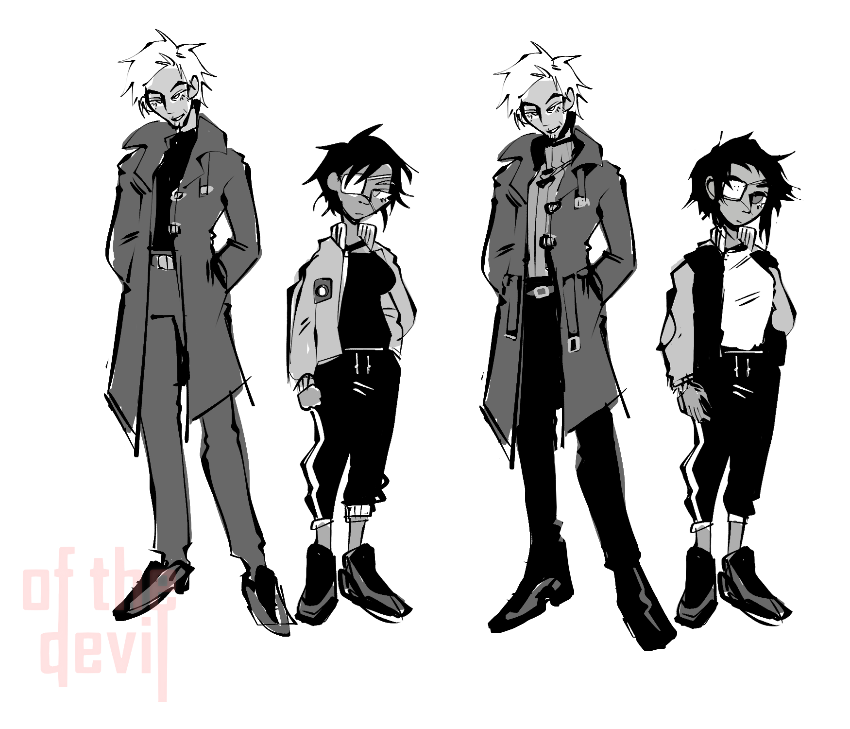
Silhouettes are important in character design, and so when you have two characters that are going to be spending a lot of time together on screen, right next to one another, you want to make sure that they “fit” well. This was already taken into consideration subconsciously in the original concept art with their framing and posture, and so we made sure to keep that through-line. In their final sprites, their color palettes also compliment one another as inverses, with London’s irises and backdrop matching Reyes’ jacket, and her cyber-eye and neon shadow matching the warmer hues of London’s wardrobe.

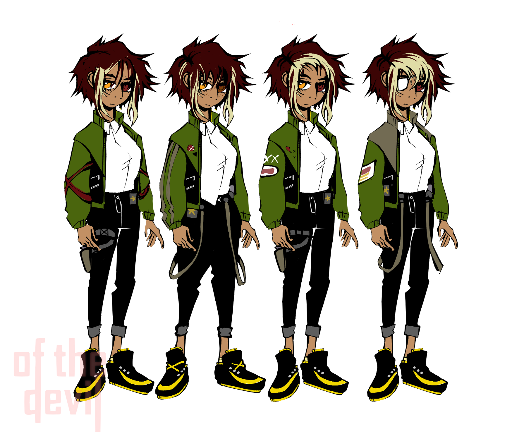
We started on Reyes- designed her as athletic and wild, energetic and proud. We gave her clothing and hair brightly colored highlights but left notes of militarism and rigidity in her dress- an Army-green jacket and a fully buttoned, tucked-in shirt, and her right hand never far from her sidearm. As the member in the duo who wears her heart on her sleeve (loudly) we also made sure that her badge and gun were in full view. Reyes isn’t afraid of who she and what she does- but declaring all that so loudly in such a settled world makes it clear how badly she needs to prove herself.
Throughout the story she'll come face-to-face with the new breeds of good and evil that 2086 has spawned- and she'll have to grapple with how her society's balanced the scales of justice versus peace.
London, on the other hand, keeps his claws tucked away. His gun and badge are hidden by the calculated lay of his clothes, and his hands remain in his pockets throughout all his emotes. His slightly bowed head hides his true height and gives him a friendly, humble appearance- but his air of easy confidence combined with Reyes' occasional deference (plus the coat) gives player a hint of exactly what kind of character he is.
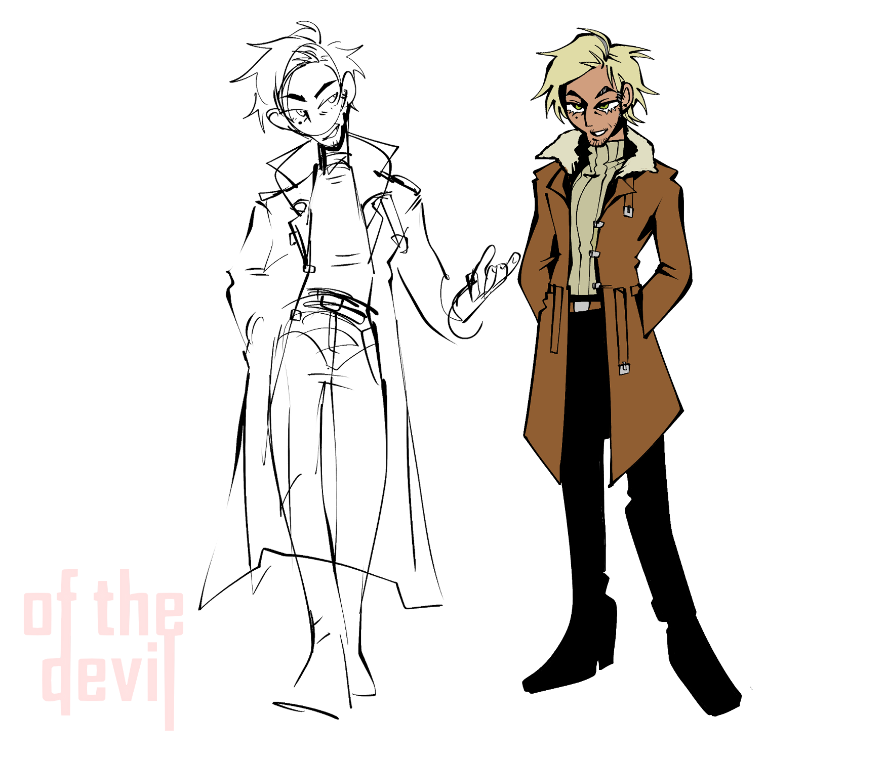
Throughout the design process he’s kept the swagger and oily charm of a seasoned gambler, though he was mostly playing the mediator throughout the prologue. He’ll soon have all too many opportunities to show how cool he can keep under the unique pressures of late 21st century law enforcement.
Synthesis
The two detectives were always meant to be clashing personalities- every iteration of Reyes was young, idealistic, sporty and short-tempered. London was always written as apathetic, practical, compromising and experienced. The (only) young blood in the homicide office, Reyes’ adoption of new technology and “punk” styling would contrast strongly against London’s passivity and conservative dress.
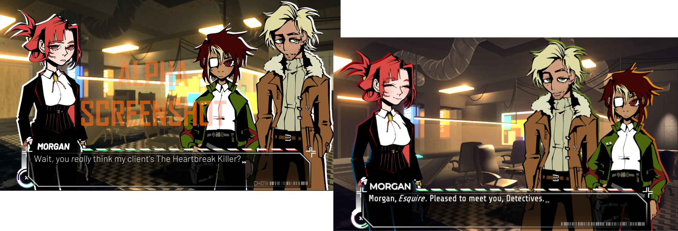
But as their designs evolved to better express the wide range of emotions and character beats we knew they needed to hit, the two characters grew closer in age. In early drafts, Farah stood on London’s right instead of his left- this put her closer to the protagonist and made her look more like she was initiating and leading the conversation. We later preferred how her silhouette looked on London’s left side, which had the side effect of giving him the lead. To match this new dynamic, dialogue and jokes were re-written to show more of her respect for her much more experienced partner, and Reyes’ strict adherence to rules and laws began to bleed into a generalized respect for authority and seniority which changed how the two partners got along.
Reyes still gets the urge to slap him out of his apathy, but it’s now out of frustration at wasted talent, and not just because of how his face looks.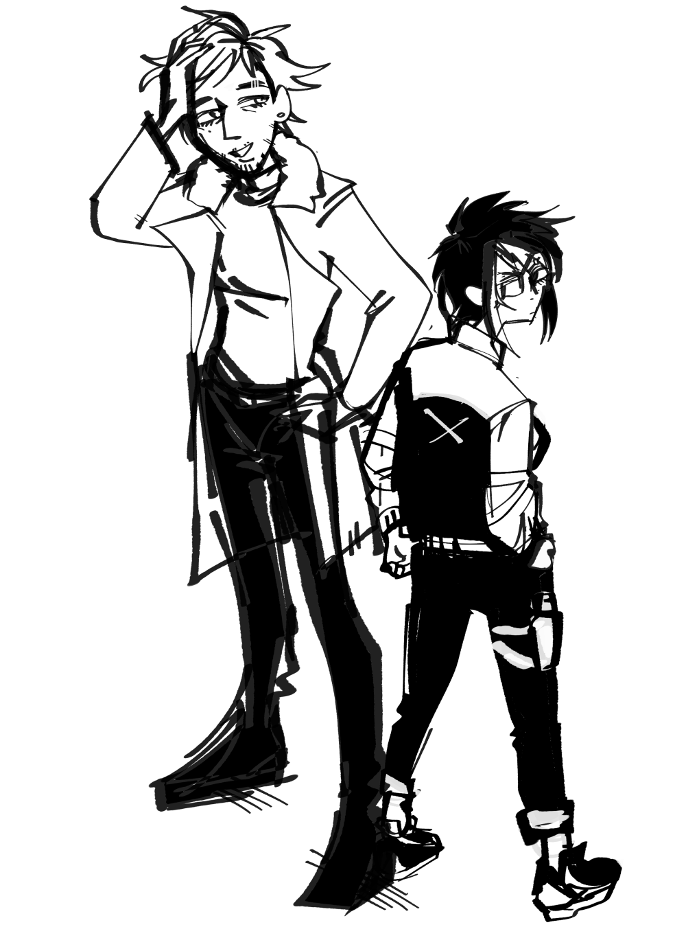
Get of the Devil
of the Devil
AN EPISODIC CYBERPUNK MURDER MYSTERY GAME
| Status | Released |
| Author | Nth Circle |
| Genre | Visual Novel, Puzzle |
| Tags | Cyberpunk, Female Protagonist, Mystery, Point & Click, Sci-fi, Story Rich, Thriller |
| Languages | English |
| Accessibility | Subtitles, One button |
More posts
- Episode 1 is Live!Feb 08, 2025
- Episode 1 Available February 6thJan 16, 2025
- 'of the Devil' is Part of Steam Next Fest!Jun 12, 2024
- Episode 0 Available Now!Mar 01, 2024
- Episode 0 Available March 1st!Feb 27, 2024
- of the Devil - "Ante" MechanicJan 29, 2024
- of the Devil - "Wager" GameplayJan 25, 2024
- of the Devil - "Hand" GameplayJan 25, 2024
- of the Devil - Evidence & ProfilesJan 20, 2024
- of the Devil - "Credit" SystemJan 18, 2024


Leave a comment
Log in with itch.io to leave a comment.