Märchen Line: Post-Mortem
Thank you DevTalk for choosing Märchen Line as Judge's 2nd Favorite!
And congratulations to the developers who worked on MAMA and Spirit Driver! You can check out all the winners in each category over on the jam's main page.
With another Spooktober come and gone, Nth Circle would like to thank all the players, readers, developers and judges who worked so hard during September and October to bring this jam together. As our way of thanks for all you've done and to celebrate making Spooktober history as the first team to rank in the competition more than once, we've put together this Post-Mortem to break down how we built our biggest game jam title to date, along with some of the processes we go through to make our VNs in general. Read on for quotes and passages from individual team members, never-before-seen concept art from throughout the development, and a behind-the-scenes look at how we brought everything together in just one month.
This Post-Mortem contains full spoilers for the entirety of Märchen Line.
Concept Phase
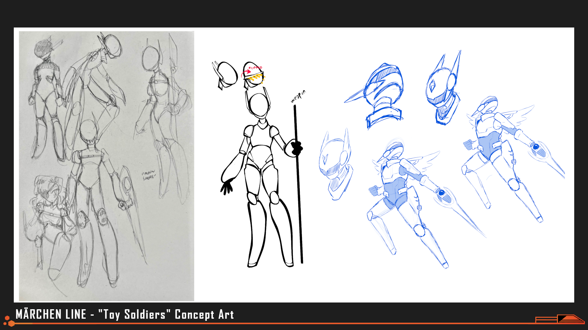
Art by evilllittlebug, aarenders
Early concept exploration and iteration on the ideas of "angelic" soldiers or "sci-fi valkyries"
Production began on this project under the working title "Real Toy Soldiers"; the key concept was a far-future dating-sim that juxtaposed a hyper-martial, anti-introspective extrasolar society that tossed its young adults into a meat grinder for meat-grinding sake against its own refusal to give those same adolescents respect and freedom of choice.
You can tell any kind of story you want with visual novels- but there are some kinds of stories that visual novels tell better than any other medium; stories about choice and fate and free will that resonate because of the game's linearity and "fixed perspectives" rather than in spite of them. "Real Toy Soldiers" was that kind of story.
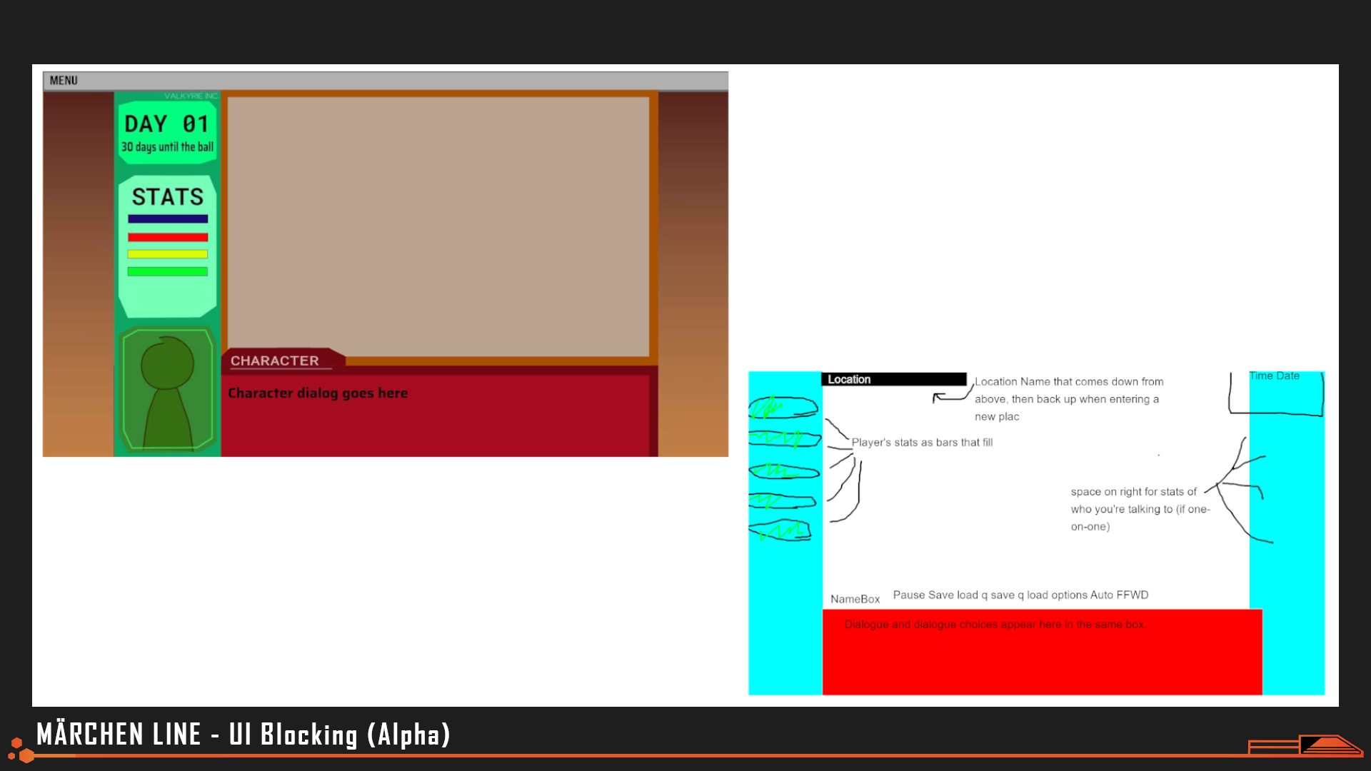
Mock-Ups by Marinakazam
Blocking out the general screen real estate that our game would use- Deciding this early on helps narrow down sprite size and cropping for the character art team.
"This was my first time working on a game, so I was a little nervous joining a team that had knocked it out of the park a few times before already. Game UI is something I’m really interested in, but hadn’t had any experience with, so I didn’t want to submit anything that was below the quality threshold that the Nth Circle had already established. I feel really lucky to have been working with [a team that had been] through the gauntlet before. Being able to work with everyone on the team, receiving feedback, and seeing people play the game was a really gratifying experience."
"Having completed the [game development] pipeline once [now], I can say I definitely underestimated the aggressive timeline, and hindsight has given me the wisdom to understand the parts of the project I spent too much time on that I should have found efficiencies for, and what areas I’d like to expand/improve on if I get the opportunity to work on another game. Still, I had a lot of fun and am so proud of the game we made."
-Andrea, UI Design
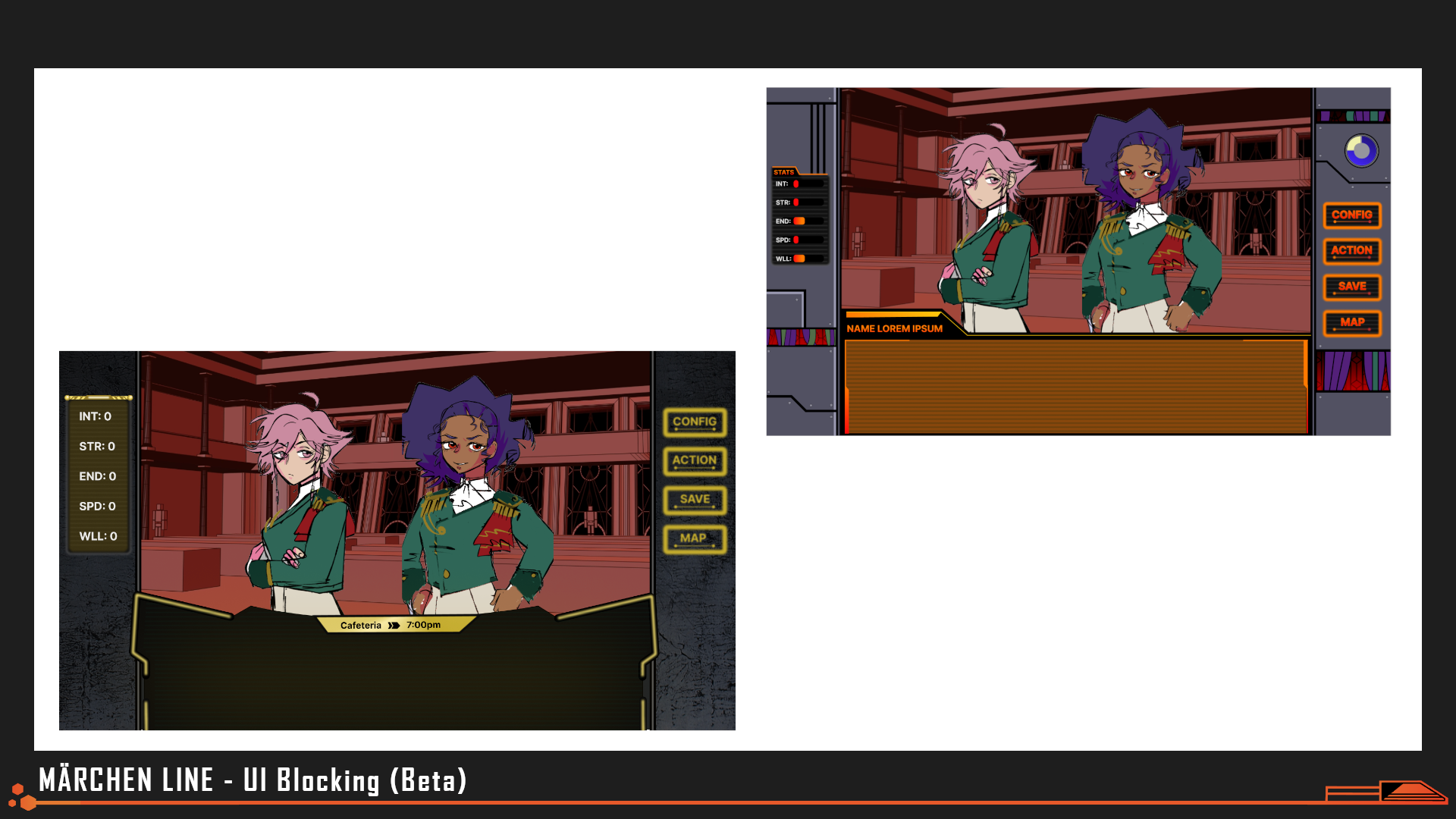
Mock-Ups by Andrea
"Alpha" mock-ups of the typical dialogue UI. Initial ideas drew inspiration from RTS games for a "military" feel, but we ended up prioritizing a more comfortable reading experience with less jarring geometry.
"There were a few different considerations that factored into the best way to achieve the dated-futuristic GUI. Since the HUD would take up a not-insignificant portion of the GUI at (almost) all times, it could almost be considered a part of the of set dressing; it needed to compliment what was happening on-screen without competing with it. Ultimately, the two biggest inspirations I pulled from were the simple, but compelling graphic motifs from 90’s mech anime like Evangelion, along with colder, industrial aesthetic of early Fallout games to compliment the militaristic setting of the story."
"...I began by trying to identify what the different disparate UI elements would be and how they came together to fill the space of the computer monitor. After roughly blocking out the main areas, I moved on to creating the final HUD elements and styling (for dialogue boxes, buttons, and menus)."
"[In the future I'd want to] take about a week before the project begins to familiarize myself with whatever engine we’re using...That way, I can get a clear sense of the elements I can control, and what are fixed. There was a good amount of time that I used for exploration for things that couldn’t be changed..."
" I definitely underestimated how quickly the 30 days would go by...For future projects, I’d probably want to cut the amount of initial blocking in half and get that pretty much wrapped by the first week, to really focus on iterations of the GUI...I think I’d need to work pretty closely with the [game development team]...from very early on to start cutting pieces ASAP...[allowing us to iterate more] on the user experience aspects of the GUI—transitions, animations and FX..."
-Andrea, UI Design
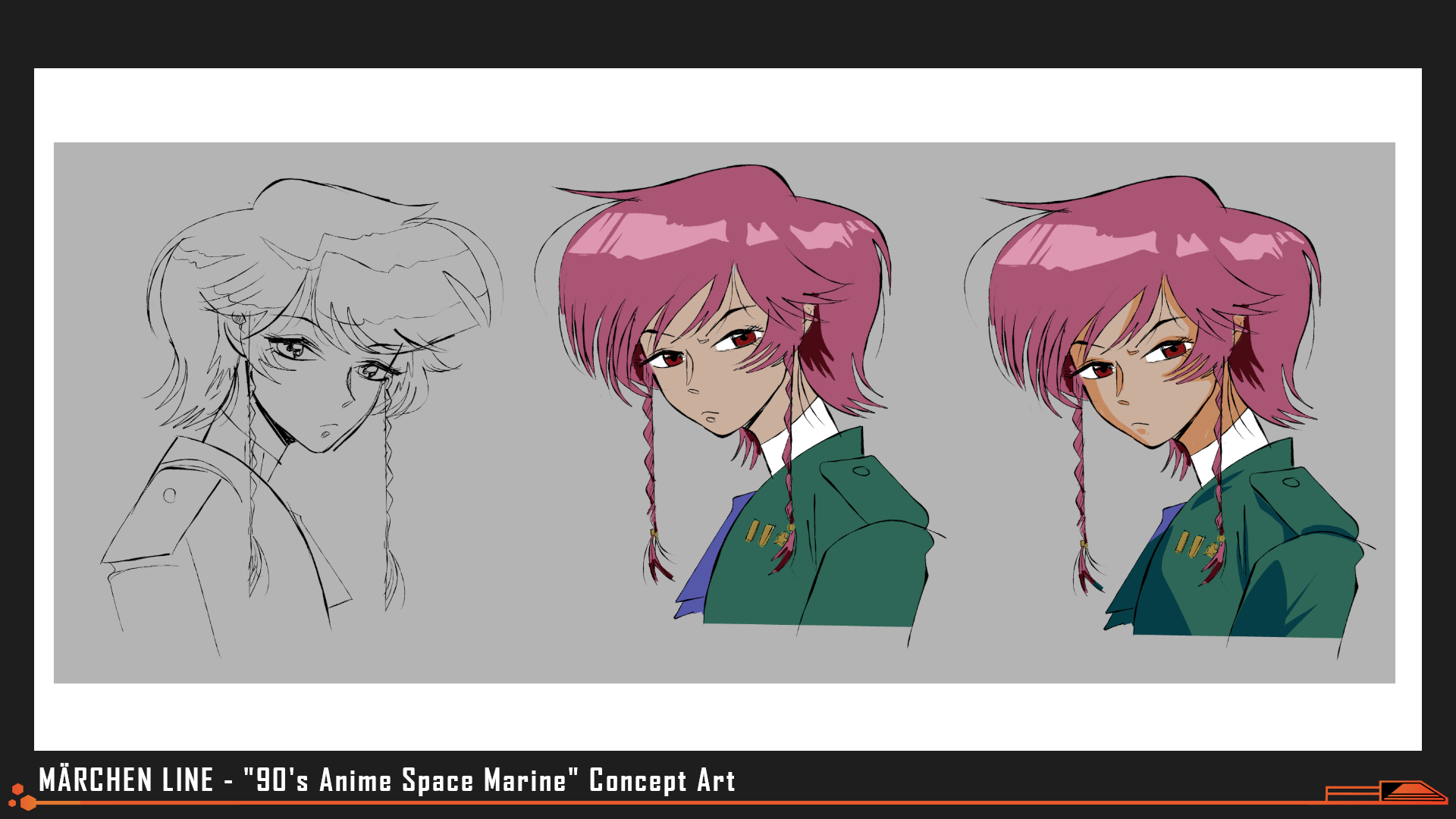
Art by evilllittlebug
Early art style test to help character designers and artists nail the features reminiscent of 90's anime.
"Model Employee had 7 character sprites (and 2 protagonist headshots)...[With plans for] 11 unique character sprites, 6 with an additional outfit with headgear...we had to make the unfortunate decision early on to cut a lot of customization with expressions. It's always a push and pull with timing on game jams but I'm so pleased with our cast lineup in the end. You're not going to make something for everyone with only 4 dateable options, but I think we got a range of unique appeal to match with the delightful character writing from Brian and Alter."
-ilmenskie, Character Art
While Model Employee specifically sought to emulate the look and feel of PC-98 visual novels, for Märchen Line we aimed to match the atmosphere of 90's anime. We applied post-processing to our backgrounds to add visual variety, but we kept the palettes limited and left the character sprites un-touched, counting on art style and direction to sell the "time period" rather than VFX.
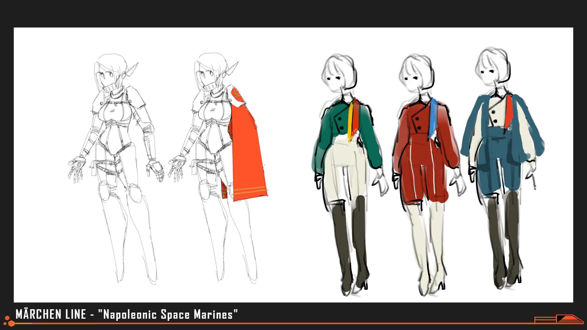
Art by evilllittlebug, Alter
Concept art for "battle" and "academy" outfits, with inspiration drawn from the fashion of the Napoleonic empire and medieval knights.
"Märchen Line marks my third time as a contributor on an Nth Circle production, and with each submission I have felt how we’ve grown as a team–and myself as an individual artist. It was an honor this year to be a part of the character art team and help bring our cast to life with color and expressions based around ilmenskie’s fantastic linework."
"My goal each jam is to push myself to try something outside of my comfort zone, and this year’s biggest hurdle for me was… cel shading! While my own drawing style is already heavily anime-inspired, my preferred rendering technique tends to lean more soft, painterly, and diffused–the total opposite of cel shading, which requires bold and definitive strokes. Looking at retro anime, you often find that the linework is relatively simple, and the illusion of dimension all comes from carefully placed bits of highlight and shadow."
"Märchen Line was my first time trying this style in earnest, and there were definitely times I wanted to bash my head into my desk as I agonized over the feeling that I wasn’t getting it “right.” Characters who had more defined folds in the linework or more rounded shapes (like Khara, Nissa, and Ruby) came with relative ease, whereas those that were a little boxier to start with (Aksel and Niels) felt like a struggle. It can be really tricky to create that illusion of depth when you have less information in the lines about where to place things to start with!"
-fawnedness, Character Art
"Backgrounds and 3D Art" by Aarenders
"Märchen Line was definitely one of, if not the most, ambitious game jam project we’ve done. Even though most of the game takes place on a singular ship, there needed to be enough unique locations for our friends in the 404th to exist without it feeling same-y. The amount also needed to be balanced with the one month time limit, which was quite the challenge, but I couldn’t be prouder of what I was able to make in that short amount of time!"
"Coming from a photorealistic architecture and product lighting background, I originally wanted to add all sorts of minute details...Nissa was going to have a special fluffy pillow, Aksel was going to have a photo of his family, Niels was going to have his bed be slightly messy...That level of detail would have been fine for one room, but was not sustainable for the 10 environments I worked on, so I learned to kill my darlings very quickly in order to keep quality consistency while also keeping pace with the 4 weeks that we had available."
"Another challenge for myself was keeping polycount low- in my professional background, polycount is fairly negligible, as I am usually modeling, texturing, and then rendering out a [single image]. Shifting to environment design for games, however meant [having to keep] a VERY close eye on polycount, as well as optimizing models wherever I could to convey shape without straining player's hardware."
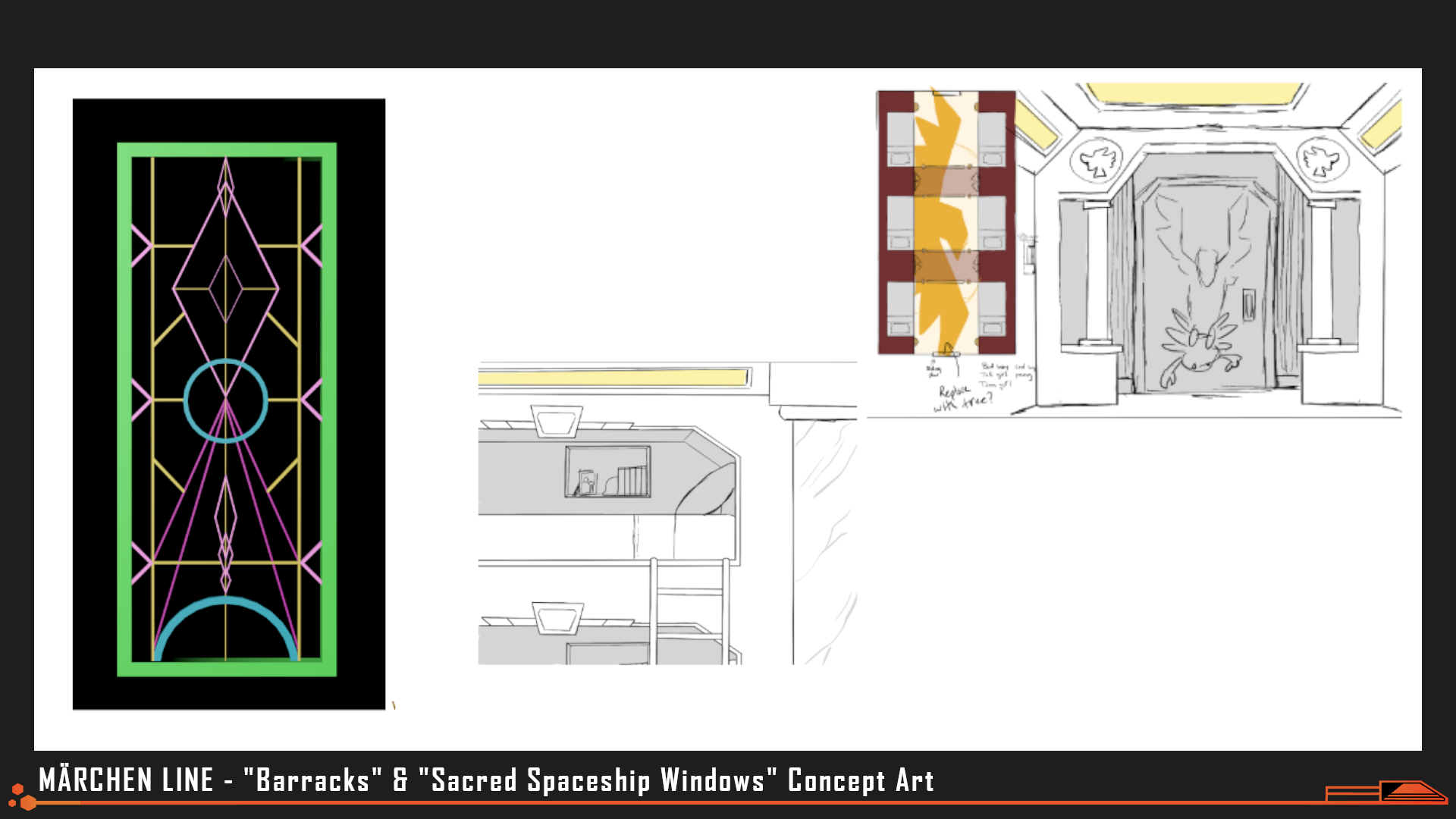
Art by aarenders
Concept art of the barracks, including scrapped concepts for "art" features that mythologized the fight against the Cancer, depicting humanity as avian predators hunting crabs.
"Going into the designs of the longship environments, the team and I spent a lot of time looking at references, ranging from Gundam to Star Trek to submarine interiors. At a certain point in the conversation, Alter asked “What about Vegas?” and that really set everything into place for the Mess Hall, Library, and a bit of the Barracks! For these rooms especially, I wanted to show off what the Voyager Armada, and to a larger extent, Homo Caelum themselves value through their architecture- this included adding Neoclassical and Georgian elements into the design, as well as having frivolous materials for aesthetic purposes like marble and granite on an exploratory spaceship. Any environment that could have civilians, I aimed to look more like being on a cruise ship rather than a military naval unit, while environments like the Sick Bay, Cargo Bay, and Lander were more utilitarian in design."
"I wanted to weave a bit of the narrative into the environments themselves. The Barracks were designed to look like the catacombs, not so subtly hinting at the pointlessness of the war against the Cancer, as well foreshadowing a certain ending you can get based on your decisions. The Mess Hall also has a detail that ended up being difficult to see, but the windows do have a little story to tell. There is metalwork on the panes, similar to stained glass, that abstractly show how the Voyager Armada blasts through planets for the sake of exploration and conquest, showing the general carelessness and harm caused by the concept of rugged exploration and frontiersmanship without any thought to conservation. Finally, at the top of the Lighthouse, Konrad’s throne has a headrest decoration on it, resembling both a halo and an abstracted bird's wings with all it’s feathers plucked, leaving only the bare bones behind, as a reference to Konrad’s stature as a legendary Soldier and how decrepit he became after taking the throne."
"To contrast the longship, with its rigid halls, emphasis on right angles, and Neoclassical design, I decided that the Lighthouse had to be more rounded and natural, as if we were in the belly of the Father himself. Additionally, the lighting I chose was also a direct contrast to the longship- a very eerie warm red and orange to offset the sterile whites and blues of the first half of the game."
-aarenders, 3D Artist
"Sound Design and OST" by James Krasner
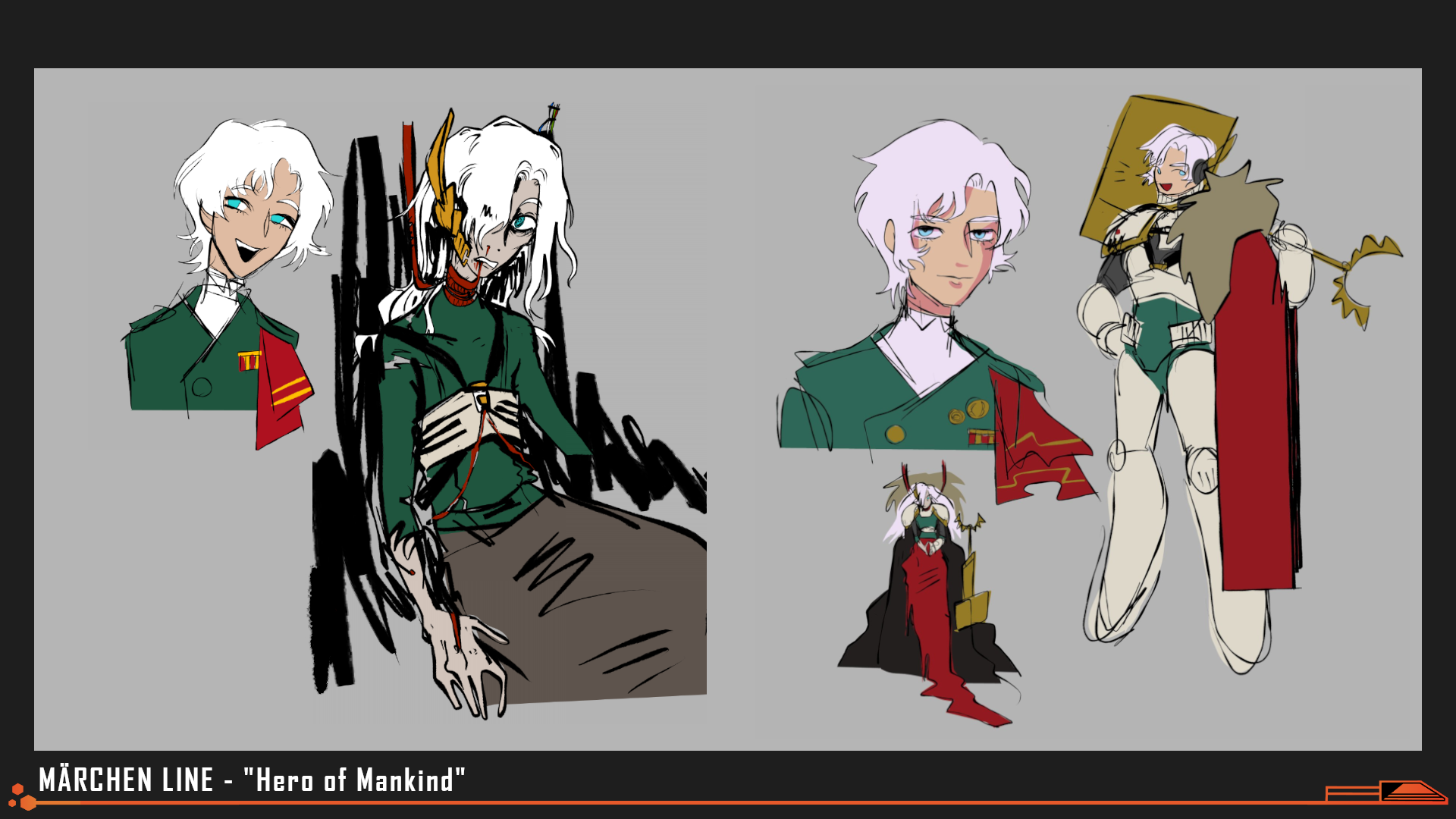
Art by evillittlebug
Konrad's character arc was heavily influenced by "Heart of Darkness," and he is named after the novel's author Joseph Conrad. His design drew inspiration from Warhammer 40k, Sephiroth and Char Aznable. His "healthy" appearance was a stretch goal for the team, and may never have appeared in the script. To compensate for the fact that we only had two sprites for his "younger" look, we used heavy pixel-ation and blur alongside an obtrusive Tik-Tok inspired UI to provide visual variety during his "livestream" monologues.
"I began my work on the sound for Märchen Line [in earnest] 11 days into the jam...After spending a day organizing what needed to be made, I got to work...[and] the rest of the month was a serious sprint. Fortunately, I happened to be in-between jobs, so I could commit...12+ hours a day [to] the game."
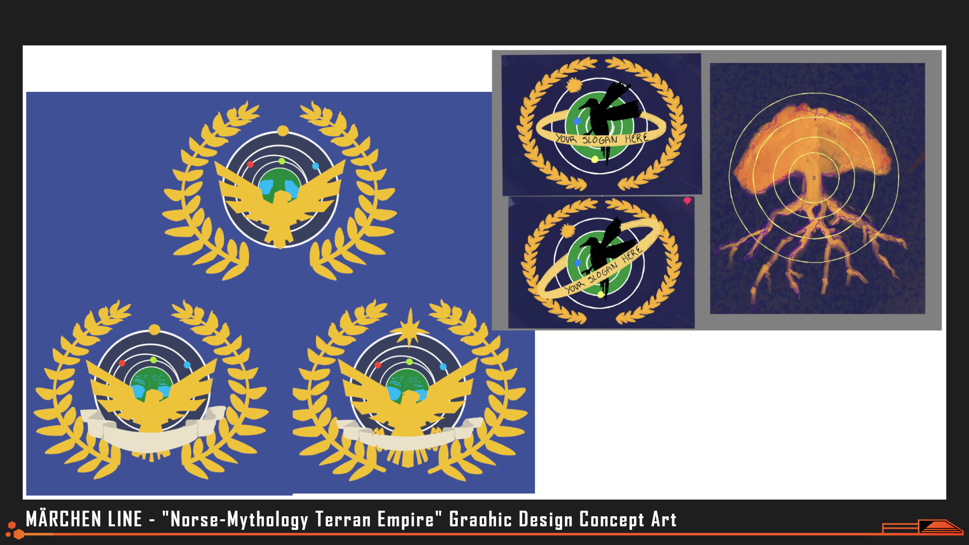
Art by Marinakazam
The Solar Republic's mythology is based heavily in Norse tradition and their veneration for an All-Father. Ravens, Odin's messengers, were added to the in-universe iconography in place of the traditionally fascist birds-of-choice. While the "globe" at the center of the flag might look like Earth at a glance, it is actually a tree, in reference to Yggdrasil and the Solar Republic's branching warp-network. Because Homo Caelum are unwilling to occupy Earth, they don't even know what it's current surface looks like.
"[My first priority was] the SFX. All of the game's sound design was done within one Reaper project. As a result of the layering involved in my process, I used a total of 568 tracks. I was also intending on doing the audio implementation in FMOD so I could have direct control over the mix and iterating upon sounds [throughout] development. Unfortunately...we found out that integrating FMOD with Naninovel's script system in Unity was not going to work...I had already done all of the audio mixing in FMOD so this meant I had to go back into the DAW, mix the sounds at the file level, and bake in reverb which took me most of an extra day. I'm quite happy with how the SFX turned out in the end. I made 116 SFX in total."
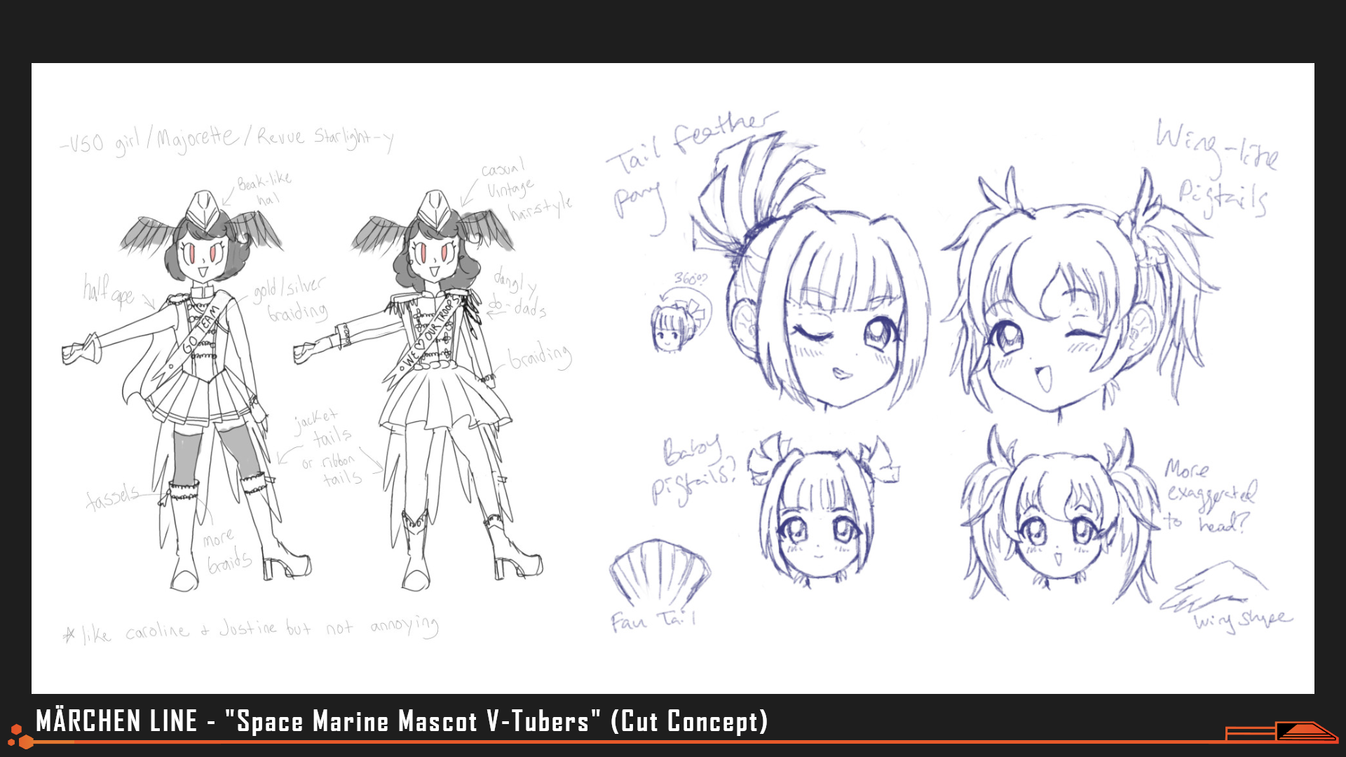
Art by Marinakazam, fawnedness
Early versions of the script included more direct interference from the Father in Soldier's lives; His raven servants would appear to obstruct violence or mess with the player's UI at various times. It was proposed that Huginn and Muninn, Odin's two most notable ravens, would be anthropomorphized as "Ginny & Munny," "V-tuber-like" mascots for the entire military. Ultimately we felt this concept was too close to Penny from Model Employee, so we cut these characters to save on art assets and kept the censorship stark and analog.
"I had some hesitation when I was first asked if I could do the music for this game...composing all of the music would be a huge lift on top of the sound design. However, I had always dreamed of making music for a VN and decided that I would like to be the sole audio person on the project, regardless of the extra time commitment required. By the time I started working on the music, I needed to have an output of at least one track per day to meet the deadline. Fortunately, Brian provided references on the most critical music tracks and I could use these to understand the central feeling of the game. {I kept] the production fairly simple to save time, which actually worked nicely...to capture the feel of classic VN music."
"I still had some hiccups during the process...Most all of the tracks went through numerous rounds of independent high speed revision to get right, especially the melodic ones. I rewrote the melody for "Happy Days" nearly 6 times and struggled to find something that fit, so I reached out to my brother who also makes music and he hummed a couple melody ideas into his phone for me. I ended up using 9 notes of one of his ideas to build the main melody that's in the track now.
Creating this soundtrack was a helpful exercise for me. I tend to focus a lot on production in my music and creating these [11 music tracks] with a focus on composition instead has made me realize the importance of the melodic idea at the core of my music."
"I was shocked when I heard that Märchen Line had won Best Original Soundtrack. I put so much into both the sound and music of Märchen Line and did the best I could with the amount of time I had. To see it be recognized this way feels so validating and I truly appreciate everyone that listened."
-James Krasner, Composer & Sound Design
Creature Design
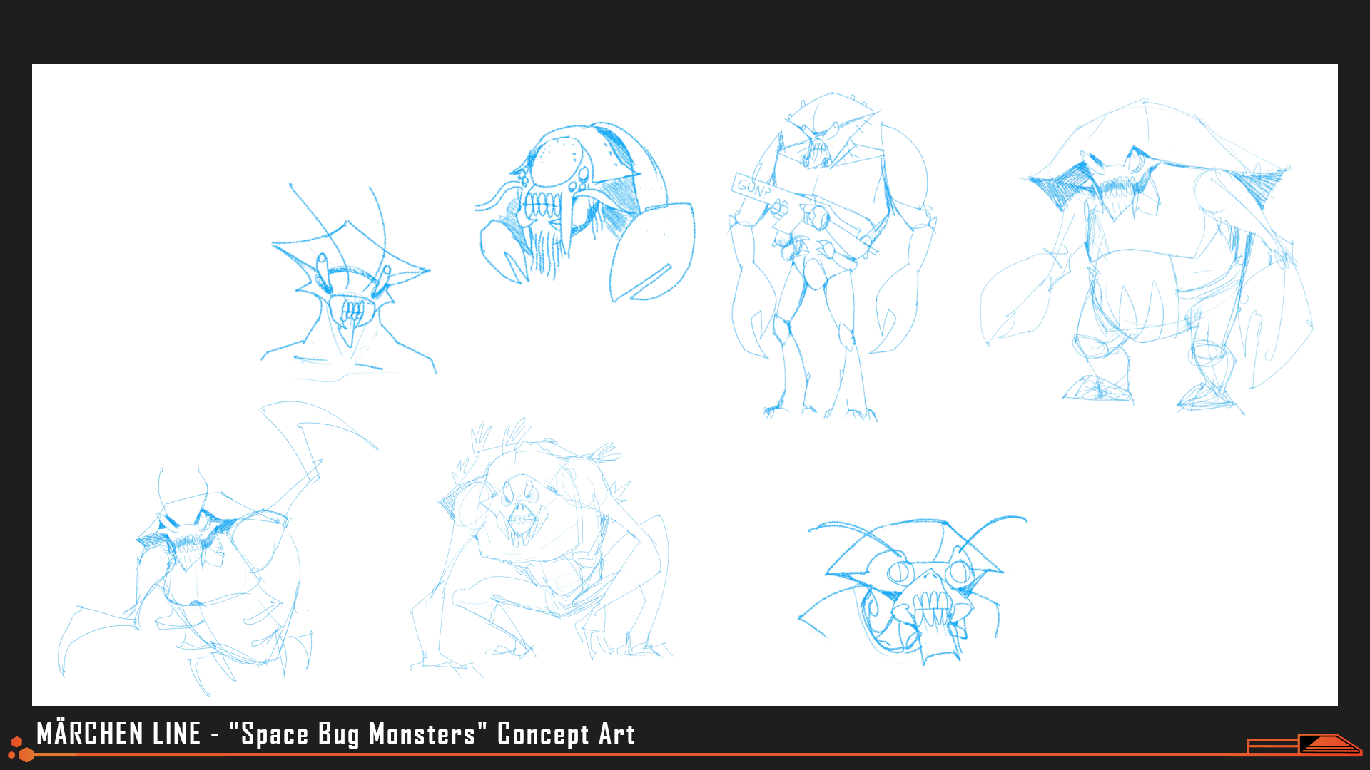
Art by Nick Mihaich
Insectoid and cockroach-like aliens were explored early on but ultimately felt too simplistic for the story's purposes.
Early concepts for the (conveniently) inhuman threat our brave soldiers would face ranged from cockroach-like bugs to abstract, geometric, bizarre automatons. Our goal was for monsters that felt "faceless," "uncompromising," and "guilt-free"- the perfect outlet for Homo Caelum to vent their frustrations on, eternally. We looked at gacha game enemies and "mob"-type aliens to nail that "endless" feel, and took inspiration from various sci-fi monsters like the Alien's Xenomorph, Starship Troopers' "Bugs", Starcraft's Zerg, Warhammer 40k's Tyranids, and even the eldritch horde of Eldrazi seen in Magic the Gathering.
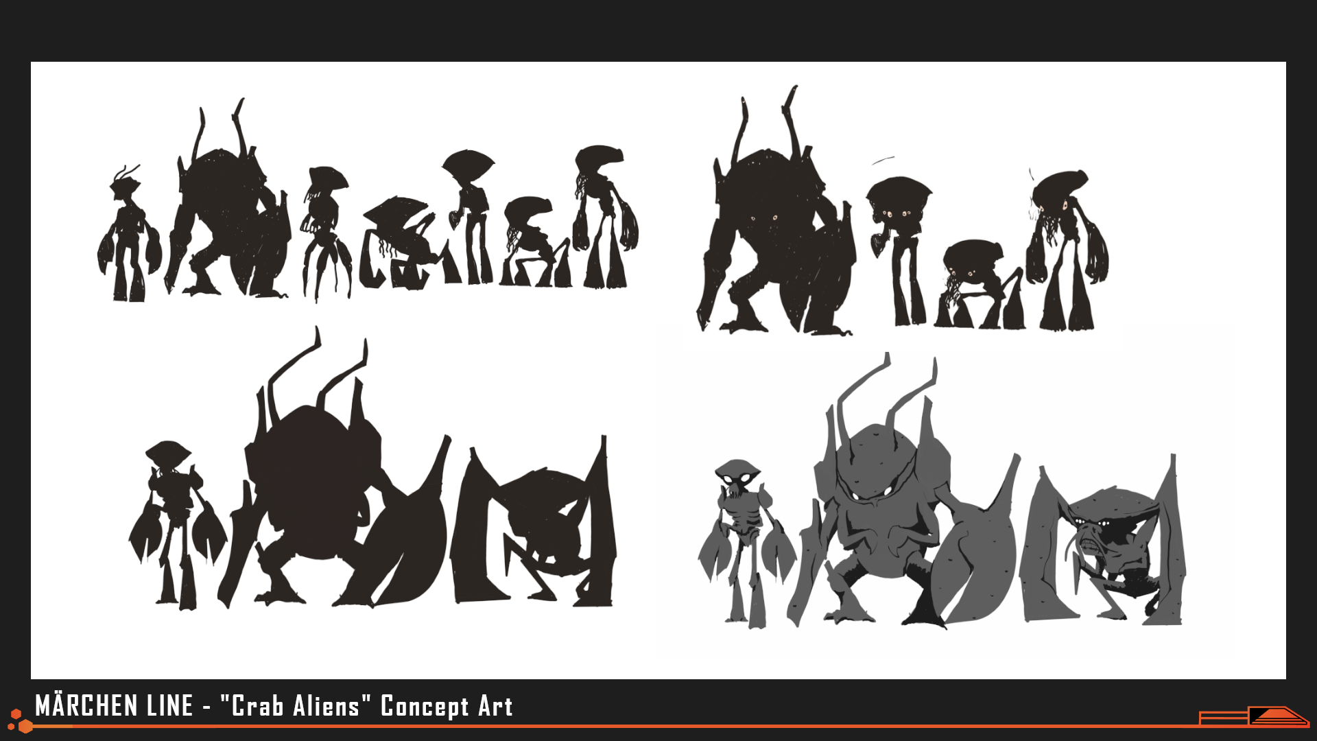
Art by Nick Mihaich
A variety of different silhouettes were tested for the aliens, based on gorillas, orangutans, "little gray men" and ocean-floor dwellers.
Ultimately our art team decided to focus on crabs and carcinization as the key biological background for our "Cancer." We referenced the hairy bristles seen on some crabs and the vibrant, blood-red shells of the omnivorous coconut crabs while designing our aliens grunts, then we gradually added more human-like posture and facial features to the more dangerous among them.
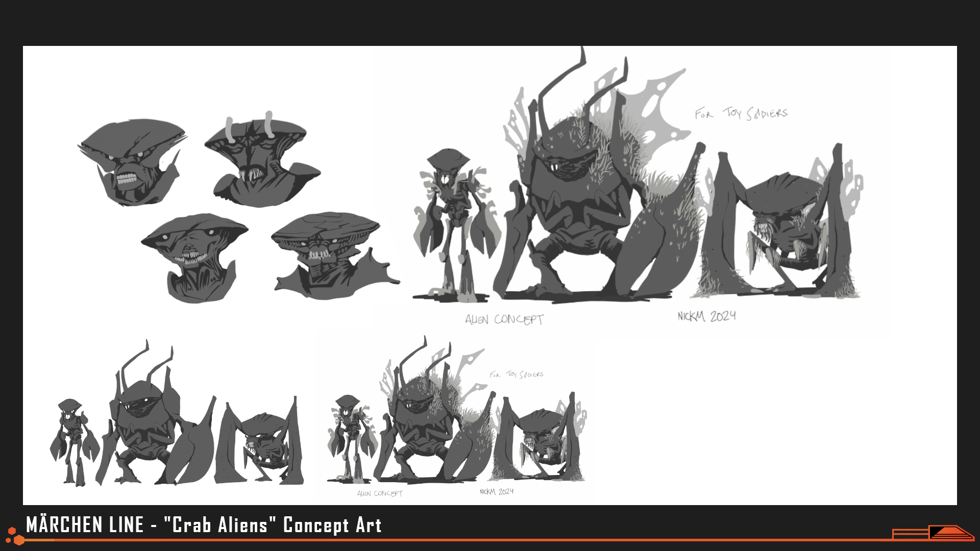
Art by Nick Mihaich
The translucent wing-like outgrowths seen in some concept art for the Cancer was based on coral, to reflect an oceanic origin.
"Having contributed to 2 Nth Circle Studios projects to date, I have enjoyed the collaboration and efficiency that comes with working with this team. Their ideas are delightfully twisted, and this year was no exception. Having served on the design team last year, and being given more responsibility this year, I was thrilled to design science fiction assets, a genre I am quite fond of. The setting and tone of [Märchen Line] match with my media tastes [perfectly], and I was honored to be granted so much creative freedom...to explore ideas."
- Nick Mihaich, Creature & Mech Design, Art
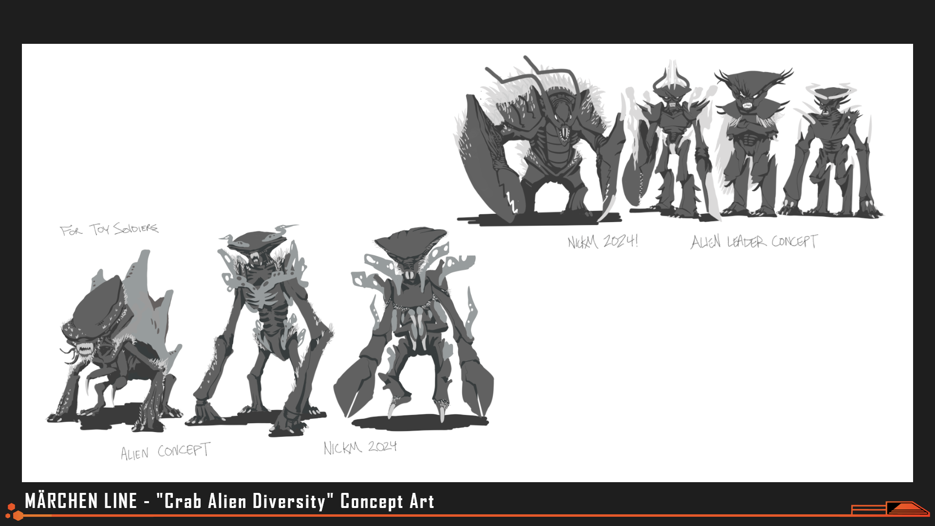
Art by Nick Mihaich
This infusion of crab DNA into the design of our monsters (no pun intended) had a ripple effect, influencing the design for our "Caterpillar" final boss monster and altering the thematic weight of the alien's presence in the story. "Cancer" literally means crab and can refer to a constellation, a possible sector of origin in the galaxy, the creatures' lethality... but a "cancer" is also a cluster of cells that grows without purpose or intelligence, to the detriment of all else around it. The label applies just as easily to Homo Caelum, who grow and fight and grow and fight without reason, merely to prolong the existence of (some form of) intelligent life in the galaxy.
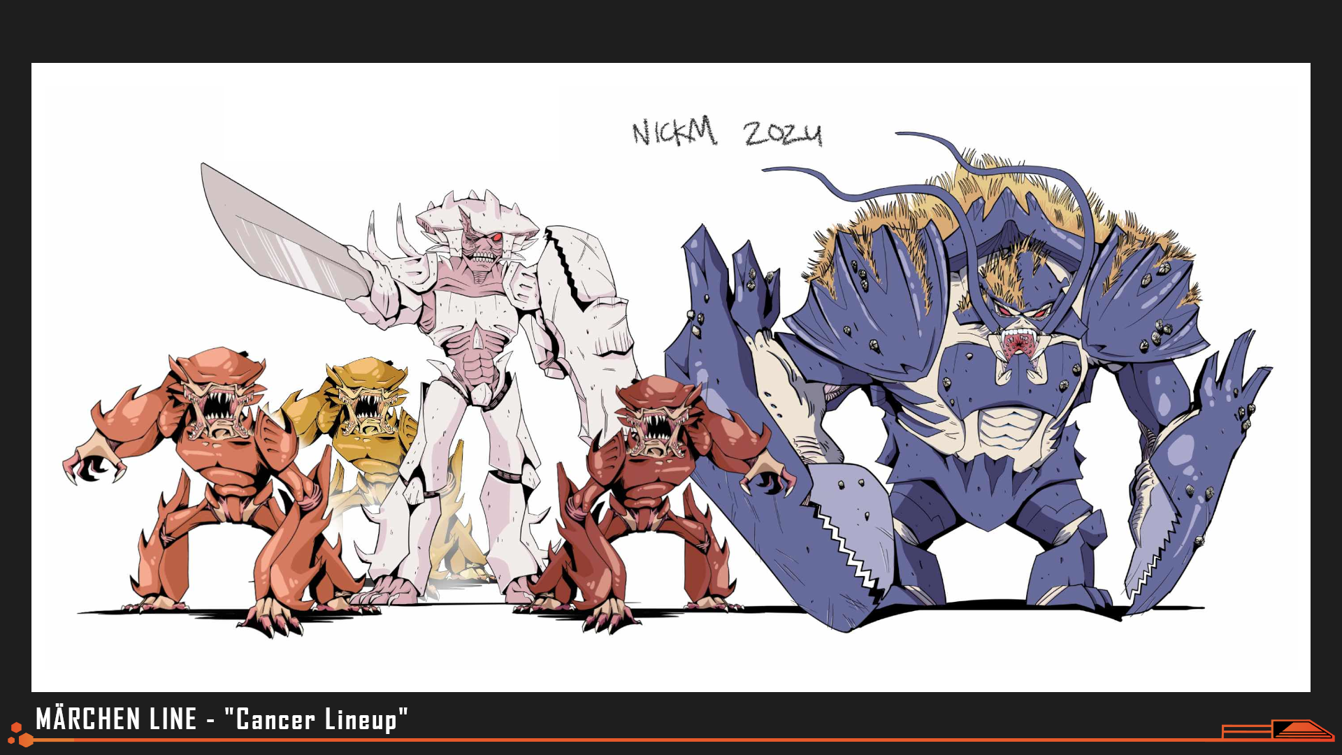
"That’s not to say I was without direction...this year I felt that Nth Circle tackled the challenge of directing a team of artists from differing backgrounds with flying colors- And everyone we brought on clearly understood the assignment. I’m so proud to be apart of these projects...and I can’t wait to see what they are cooking up with 'of The Devil.'"
-Nick Mihaich, Creature Designer and Concept Artist
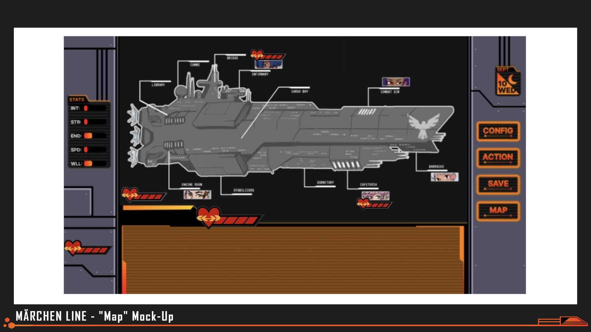
Mock-Up by Andrea, Nick Mihaich
An early mock-up for how players would choose where to spend their free time, and with whom.
Combat Design
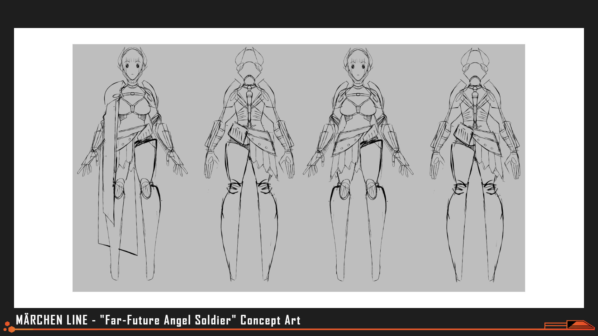
Art by evilllittlebug
Concept art for ornate, heavy armor. We ended up stripping away much of the Soldier's plating to emphasize that their own safety was not necessarily prioritized.
Early on in the planning phase, multiple ideas for gameplay were proposed and considered, ranging from stat-raising minigames to "Vampire-Survivor"-like combat training sessions that further desensitized the player and characters towards mowing down "Cancer" in droves. While we were excited to try and infuse some replay-ability into our entry this year, ultimately we were not able to recruit as many team members with coding and gameplay design backgrounds as we needed.
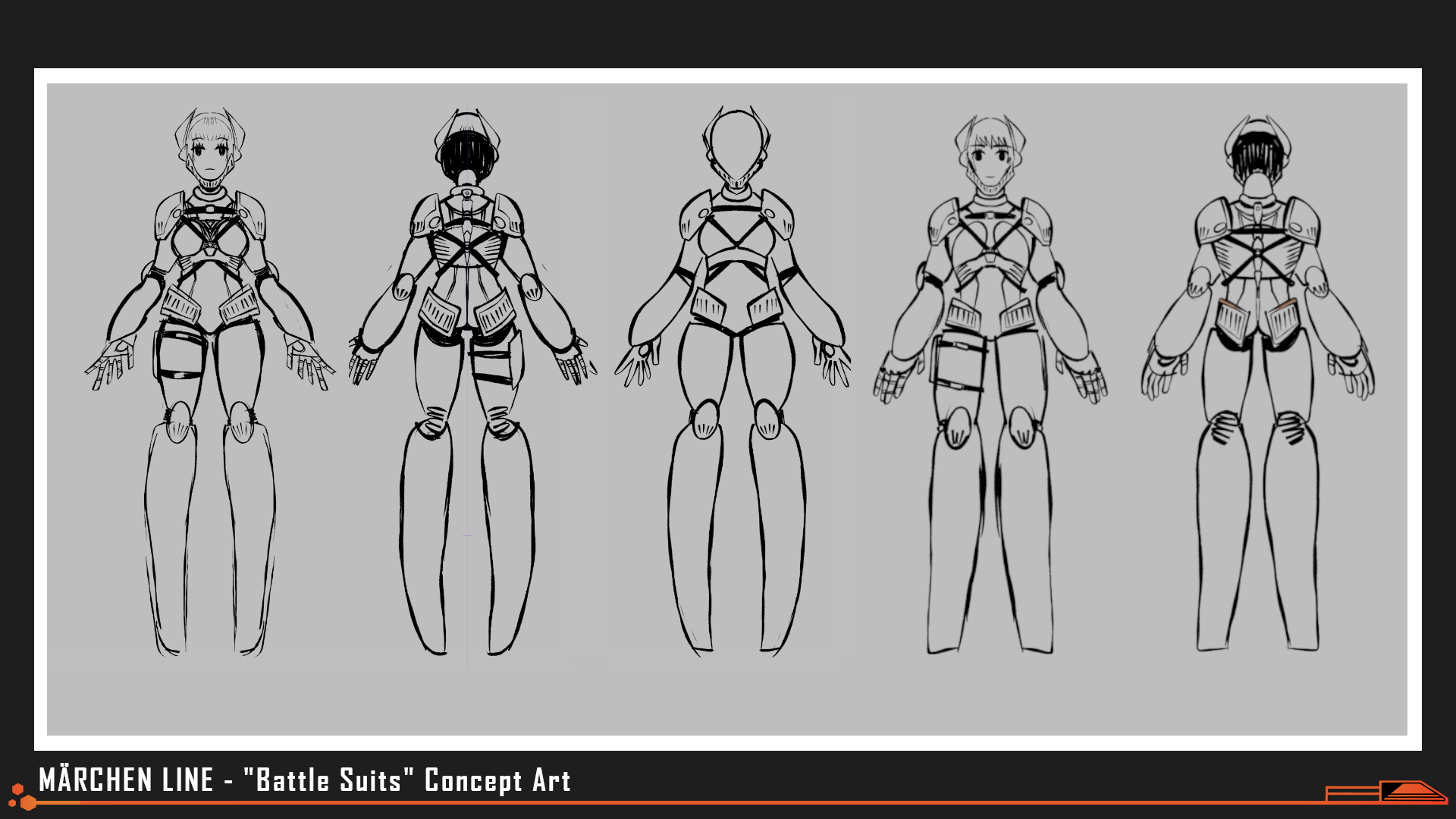
Art by evillittlebug
Many team members affectionately refer to the boot design seen here as "hooves."
But "you go to war with the army you have." So when the game jam formally began, we re-evaluated our scope, goals, and themes based on the strengths of the team we put together and decided that creating combat gameplay would not be feasible this time around...But we were still telling a story about soldiers embroiled in a forever war. What could we do?
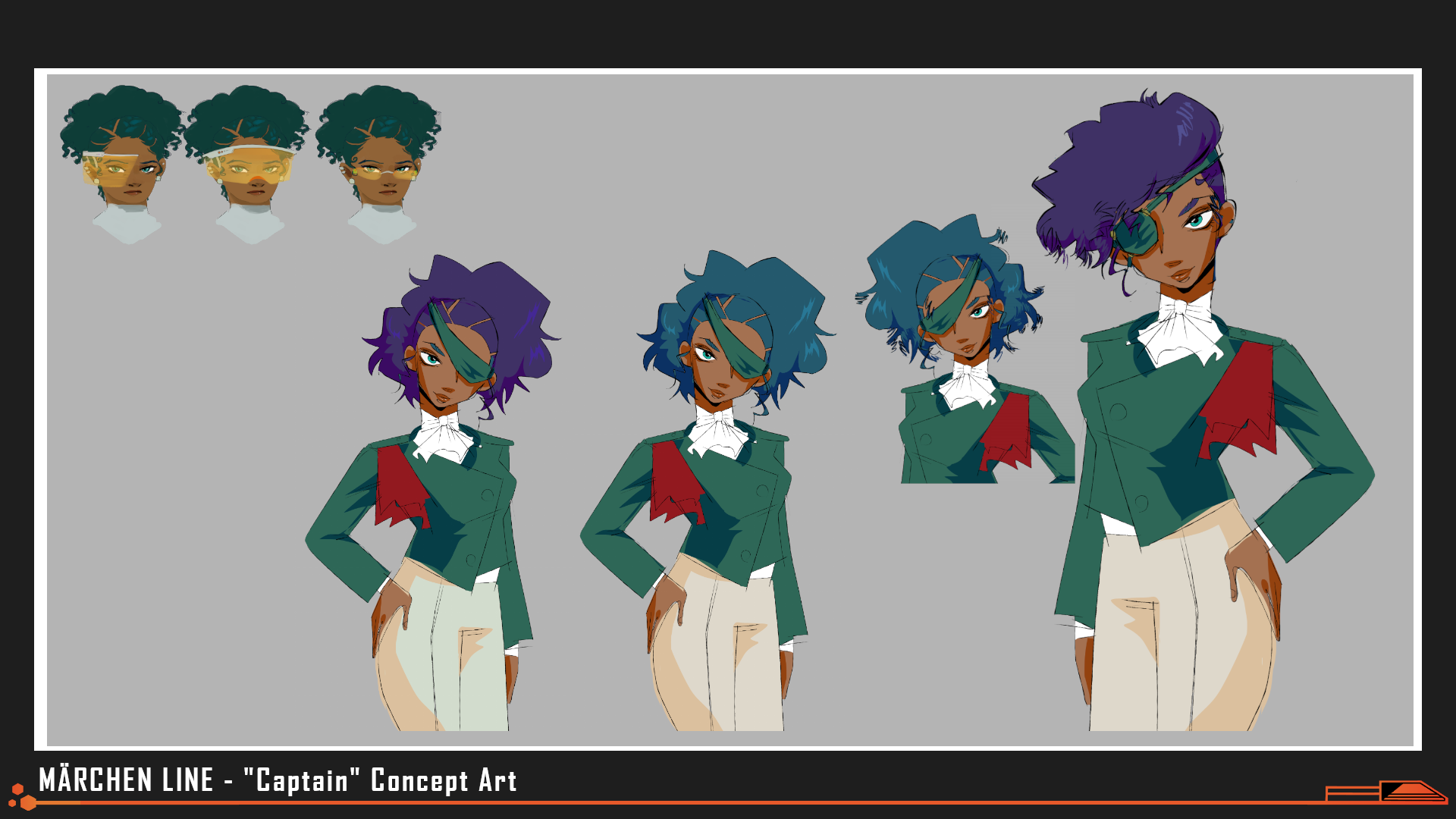
Art by beecusp, evillittlebug
Early design iterations for the captain included supplementary headgear or an eyepatch to convey her experience. As the technology and ideaology of the game's world took place, these costume choices no longer made sense for her- nanomachines could heal any non-lethal injury she sustained to her eyes and would make her vision better than any visor.
We allowed the limitations of the jam to guide our hand. If we couldn't include gameplay or visuals for our combat, we'd go in the opposite direction. We dismissed all the normal, dating-sim-esque UI and blacked out the entire screen save for a crawl of text. Emphasizing fear of the unknown, claustrophobia, and sterility, we described combat through words alone, as though read out in a report afterward or summarized by a computer. This created an eerie disconnect between player and reader, and when we then further diminished player input to just picking between one of four ways to kill things, players were forced into a position of helpless, infantilized obedience- just another one of Father's toy soldiers marching along to the beat of his drum.
Lore and Worldbuilding
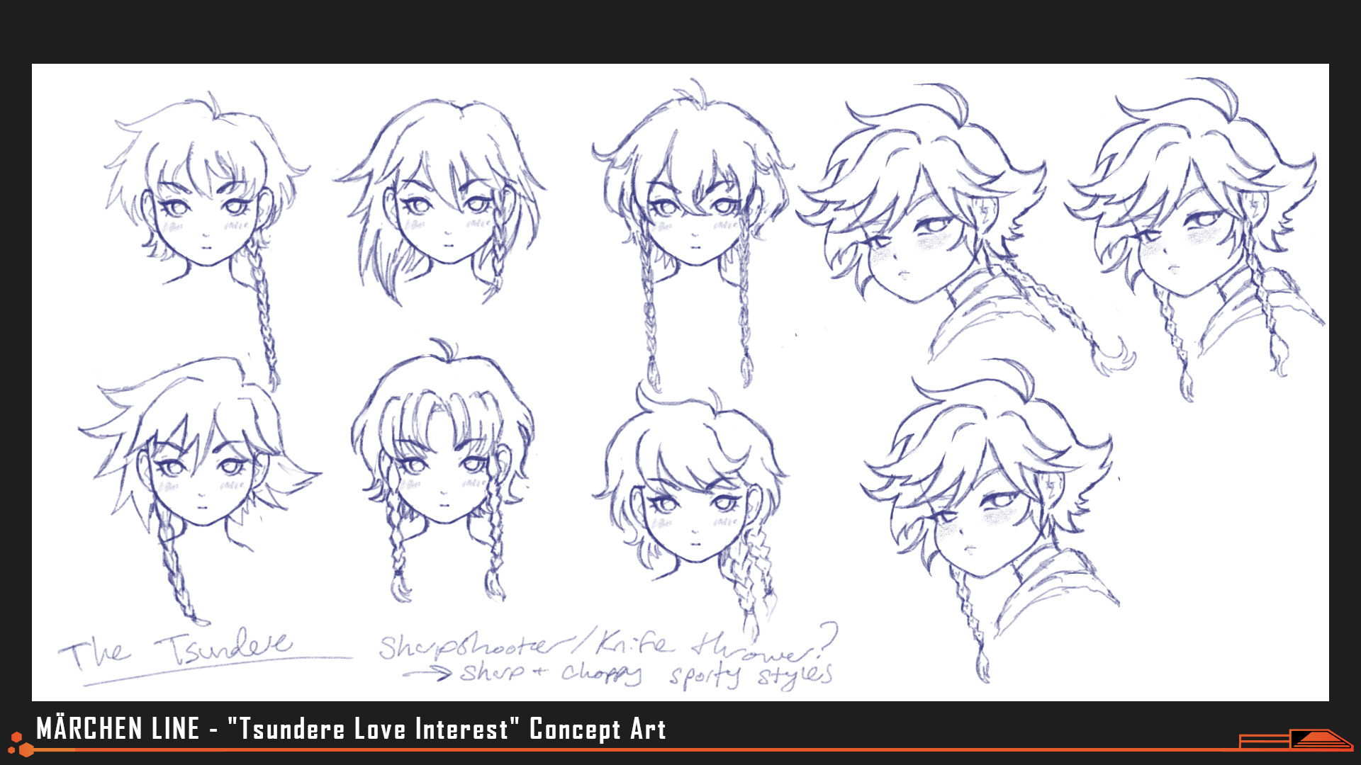
Art by fawnedness
Hairstyle tests and general artstyle exploration for Khara, who spent most of development under the name "Tsundere."
Model Employee took place in a blackly humorous vision of the near-future- a shipping warehouse overseen by a tyrannically sweet automated boss. Numerous players reported it was a little too believable, at times.
To bring players tens of thousands of years into the future of Märchen Line and the boots of a soldier, we'd have to spend a little more time setting the stage.
From the beginning Märchen Line's story had two clearly defined acts: the stat-raising dating-sim section at the start and then the surreal, survival-horror suicide mission to kill god towards the end. Early drafts leaned heavily into the jarring dichotomy at work there, back-loading the script with reveal after reveal, unfolding the entirety of Homo Caelum's history in the mother of all mind-blowing tone shifts.
It was certainly surprising, but it didn't make for good storytelling.
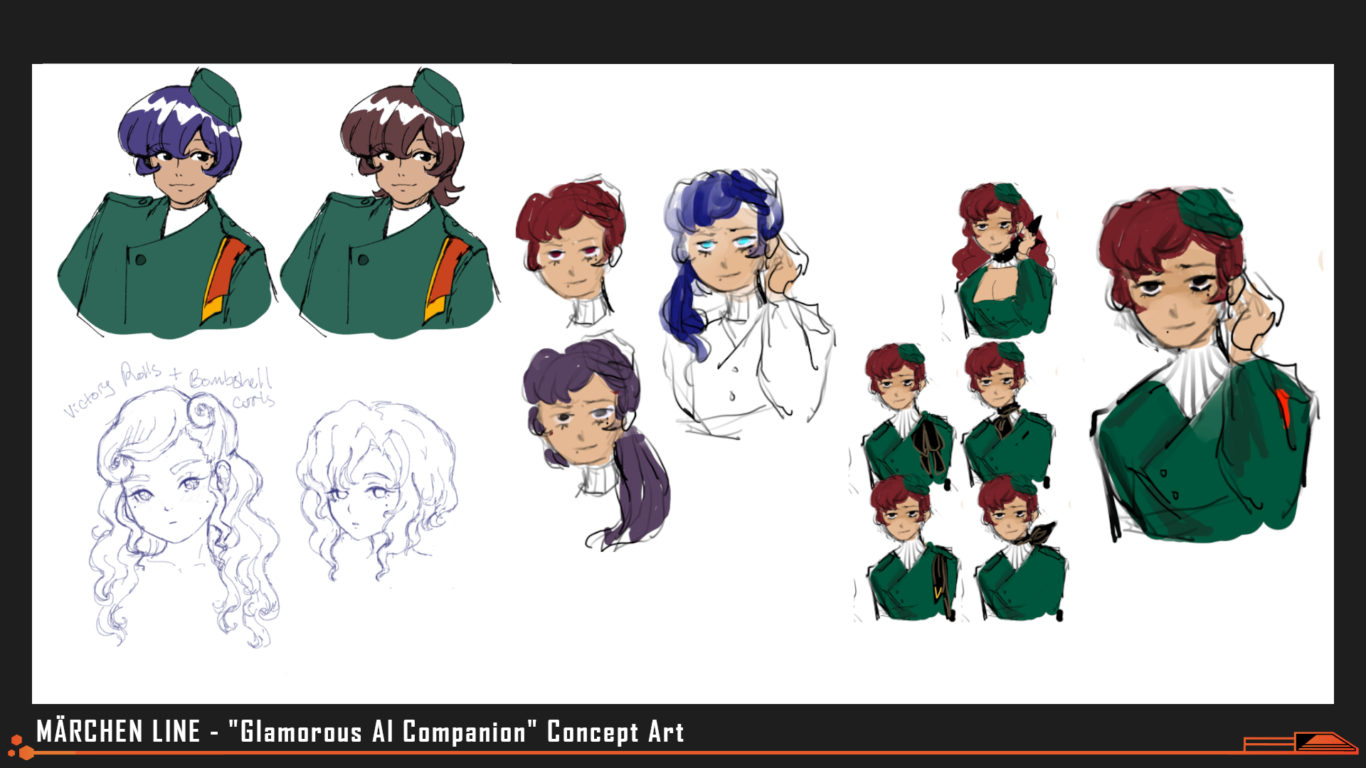
Art by ilmenskie, fawnedness, Alter
In the first draft, Ruby was much more of a "gloomy beauty" who struggled with unrequited feelings for the protagonist that players were not given the choice to reciprocate. Readers found themselves confused and felt like pursuing other romances was "the wrong thing to do" when Ruby was so clearly "the main heroine." Ruby's personality was reworked from the ground-up to be a vain goofball instead who the audience would grow to love but wouldn't feel guilty about constantly neglecting.
The script was reworked; story elements like the AI politicians controlling Homo Caelum's government or the genetic re-engineering of Homo Caelum from the remains of feral Homo Sapiens were instead "soft-dropped" throughout the first half of the game. Characters would now calmly remind one another about the insane realities they lived with as though they were the most natural facts in the world- Players were now the fish out of water, the one soldier out of line with everyone else's steps.
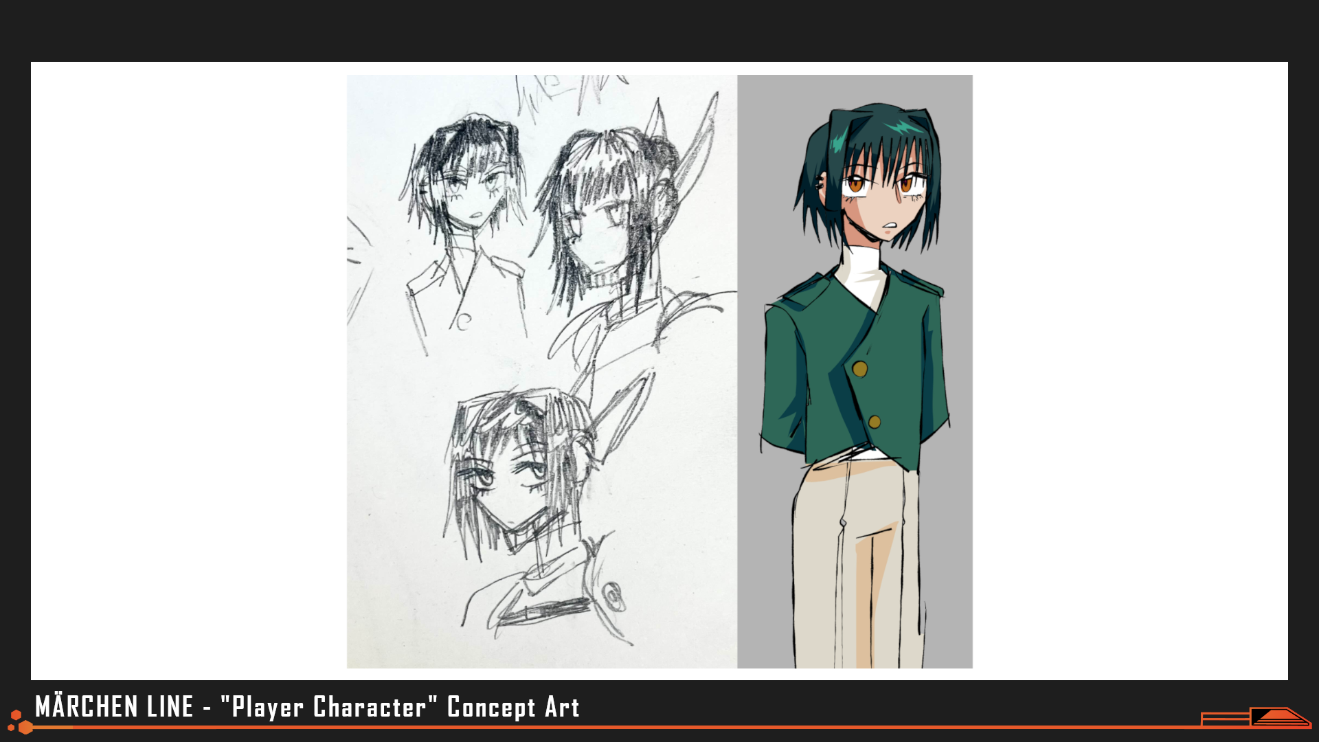
Art by evillittlebug
The player character's family name, Corsica, comes from the birthplace of Napoleon Bonaparte.
A general overview of the history of Homo Caelum was written up in an in-universe bible called the Solar Edda, named after the oral tradition with which Norse mythology was preserved and conveyed. Small snippets from this script were then placed at the beginning of each day- a ritual that players would go through alongside the protagonist to become acclimated to the martial reverence of the Solar Republic.
"Love Interests & Dates" by Alter
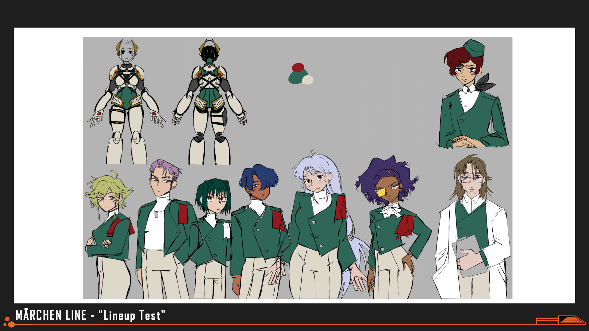
Color/Proportion Test for the cast by ilmenskie, evilllittlebug
A "line-up" of the cast done to test how their palettes and silhouettes looked when combined together on one screen.
"Jam timeline-wise, the character-focused freetime events for the love interest characters were written alongside the process of finalizing the character art and the first draft of the main story. As a reader may have come to expect from modern games with a stat-raising element (like the recent entries in the Persona series), the bond events for these characters take place somewhat out of time, and the plot marches along whether or not you choose to spend time with them. For that reason, we couldn’t include anything that had significant impact on the main plot, or even on the way that these characters would interact with the protagonist within the main plot. (Would that change if this game had more than a month of development time? Or does Corsica’s fate move inexorably towards their set of destined endings? Who’s to say? Why don’t you write in to Nth Circle about what you think? ( ᵔ ᗜ ᵔ ))"
"Many members of the Jam team read the dating scene drafts and left their thoughts, suggestions, and improvements. Since their personalities grew along with our concept art process, I feel that all of us were able to develop affection for our characters. I have to give extra thanks to Marinakazam for some of her co-writing–when I was lost for words about how it felt to gaze into a love interest’s eyes, caress their cheek, or hold their hand, I would tag her and she would materialize to write something that would make anyone blush."
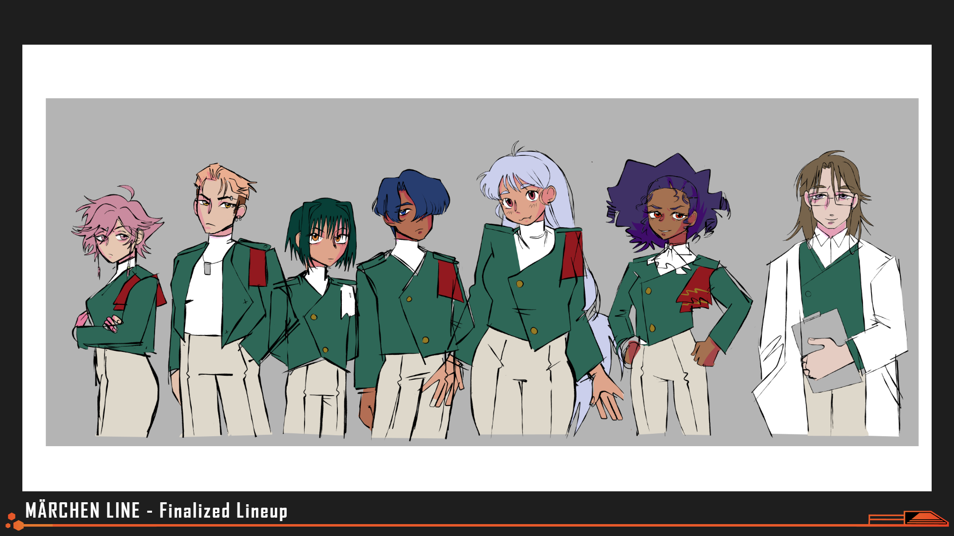
Finalized Reference for the cast's palettes by ilmenskie, evilllittlebug
A "line-up" of the cast done to test how their palettes and silhouettes looked when combined together on one screen.
"Although we call these characters "love interests”, what I wanted to convey is that these characters’ interest in you is just beginning at the time that the next arc of the game starts. At the beginning of the month, their perceptions toward the protagonist range from curiosity, to indifference, to outright dislike–and their progression through their bond storylines reflects the ways that they slowly open their hearts to the protagonist."
Niels Erricks
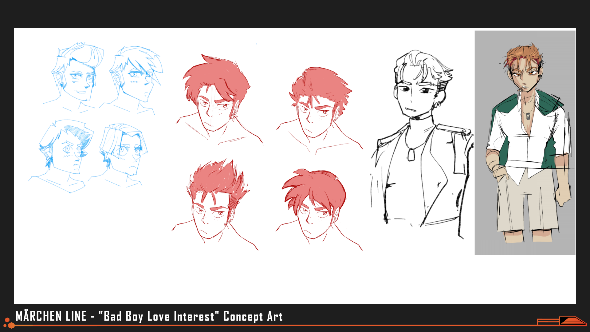
Art by Nick Mihaich, aarenders, ilmenskie, evillittlebug
"Bad Boy" and his many varied hairstyles during artstyle exploration.
"To me, the classic element for a “tough guy” route in a dating game is that it’s centered around competition or proving oneself. In his storyline, Niels challenges the protagonist to a game of chess, which turns into a rematch, which turns into a comfortable habit. I originally planned for Niels’s struggles with losing competitions to be a little less cute and more of a disheartening inversion of the tough upstart guy’s storyline–he would try his best with training, but in the end, hard work wouldn’t be enough to overcome a lifetime of odds stacked against him. In the end, he got off pretty easy–just having to make peace with the fact that he wouldn’t be able to win at chess even once within the timeline of his dating scenes."
"Niels’s ending is called “En passant.” It’s a chess move that allows pawns to capture each other under special conditions–”in passing” each other. For me, this phrase had multiple meanings for Corsica and Niels’ relationship. They meet mostly by chance, settle into their routine because they keep running into each other, and get comfortable with each other over a short period of time. In a peaceful world, they might grow old together, and be a couple you’d see sitting in the shade in a park, still challenging each other to games. But in the world that they inhabit, this isn’t a dream that’s likely to happen–the two of them, pawns marching forward to their goals, will drift apart eventually."
Aksel Hightower
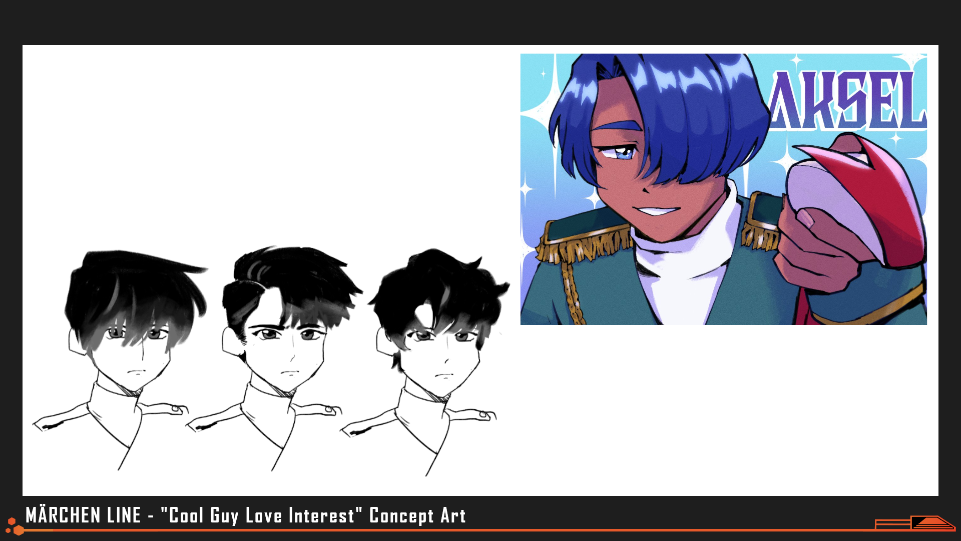
Art by ilmenskie
Aksel's name in beta scripts was simply "Cool Guy". He's still cool to this day.
"Aksel is the character with the most initial interest in Corsica, seeking them out while they’re studying on their own. His initial jabs at their habits and reading material are his way of taking their measure, and he ends up getting taken by surprise when they take learning more about him into their own hands. I wrote all of Aksel’s scenes with the idea that he was reading into every interaction, balancing how much about himself he was willing to let slip to increase their rapport while still keeping Corsica at arm’s length."
"Aksel’s ending is called “Brilliant green, tomorrow’s sky, and you.” At the end of his route, Aksel accepts a budding affection for the protagonist–but more importantly for his personality, he accepts his interest in a future long-term relationship where they take interest in each others’ lives and circumstances. For a practical, and closed-off character like Aksel, this is a shift in the way that he approaches relationships, and his softness towards Corsica reflects the slight change in his view of the world."
Nissa Mayamir
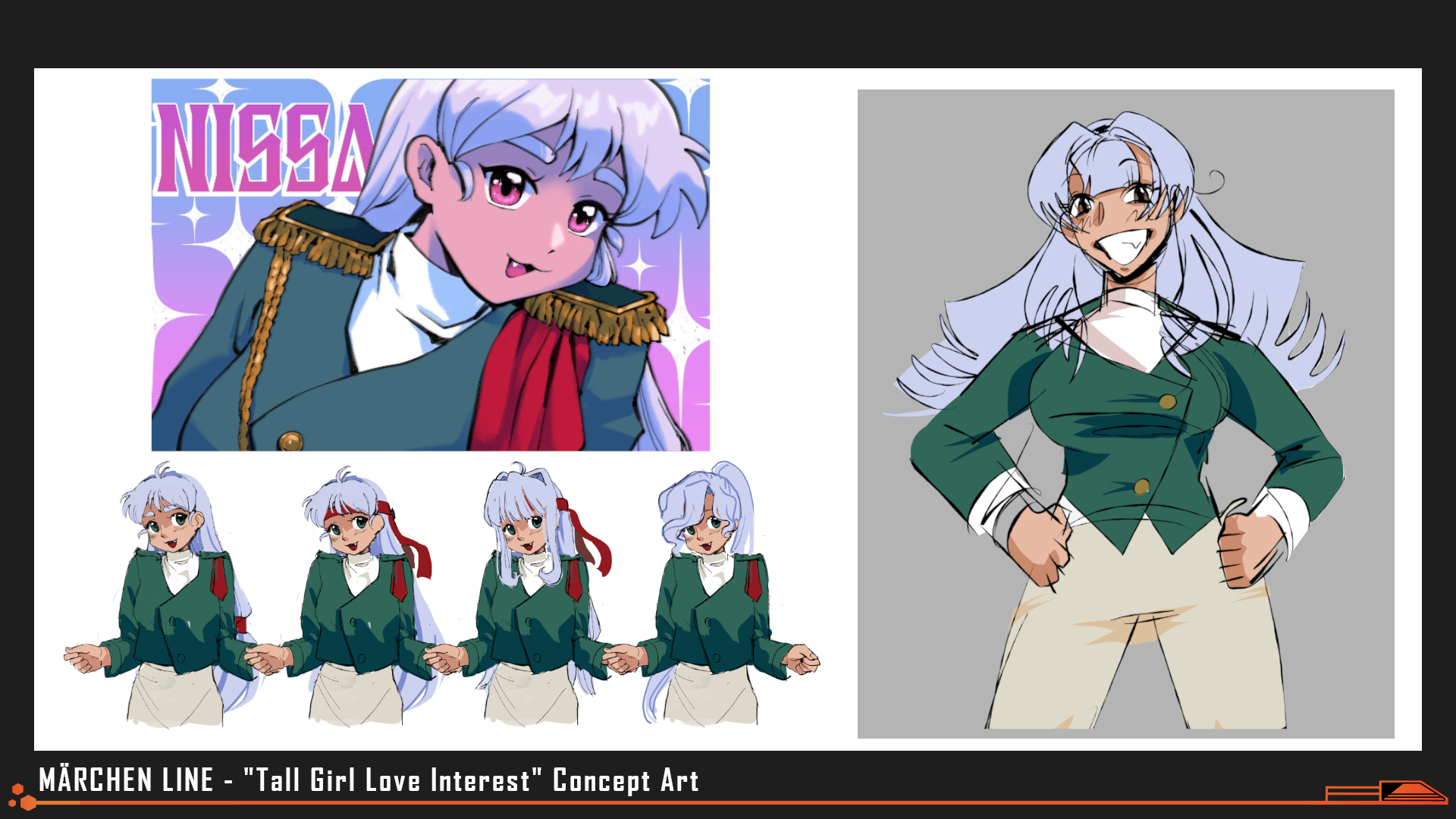
Art by ilmenskie, evillittlebug
Nissa's name throughout most of development was just "Tall Girl." Her last name Mayamir is in reference to Ymir, the founding giant in Norse mythology.
"In Nissa’s storyline, she volunteers to help the protagonist with physical training after seeing their struggles with keeping up. Nissa is one of the physically strongest members of the cast, but It was important to me to capture that she is also strong emotionally–she is hardworking, cheerful, and unbothered by interpersonal conflicts with her peers. Her weakness is her fundamental inability to make peace with the core of the world that she inhabits–a world where she has to constantly look death in the face, or choose to close her eyes to it forever with the help of her Valkyrie, losing part of herself in the process.
"In the end, regardless of the protagonist’s advice, Nissa chooses to keep looking forward. Nissa’s ending is called “With you at my side.” In a world without empathy for the weak, she chooses Corsica as her most important anchor. Whether that’s a good idea or not–Corsica is in it for the co-dependent long haul."
Khara Zaxis
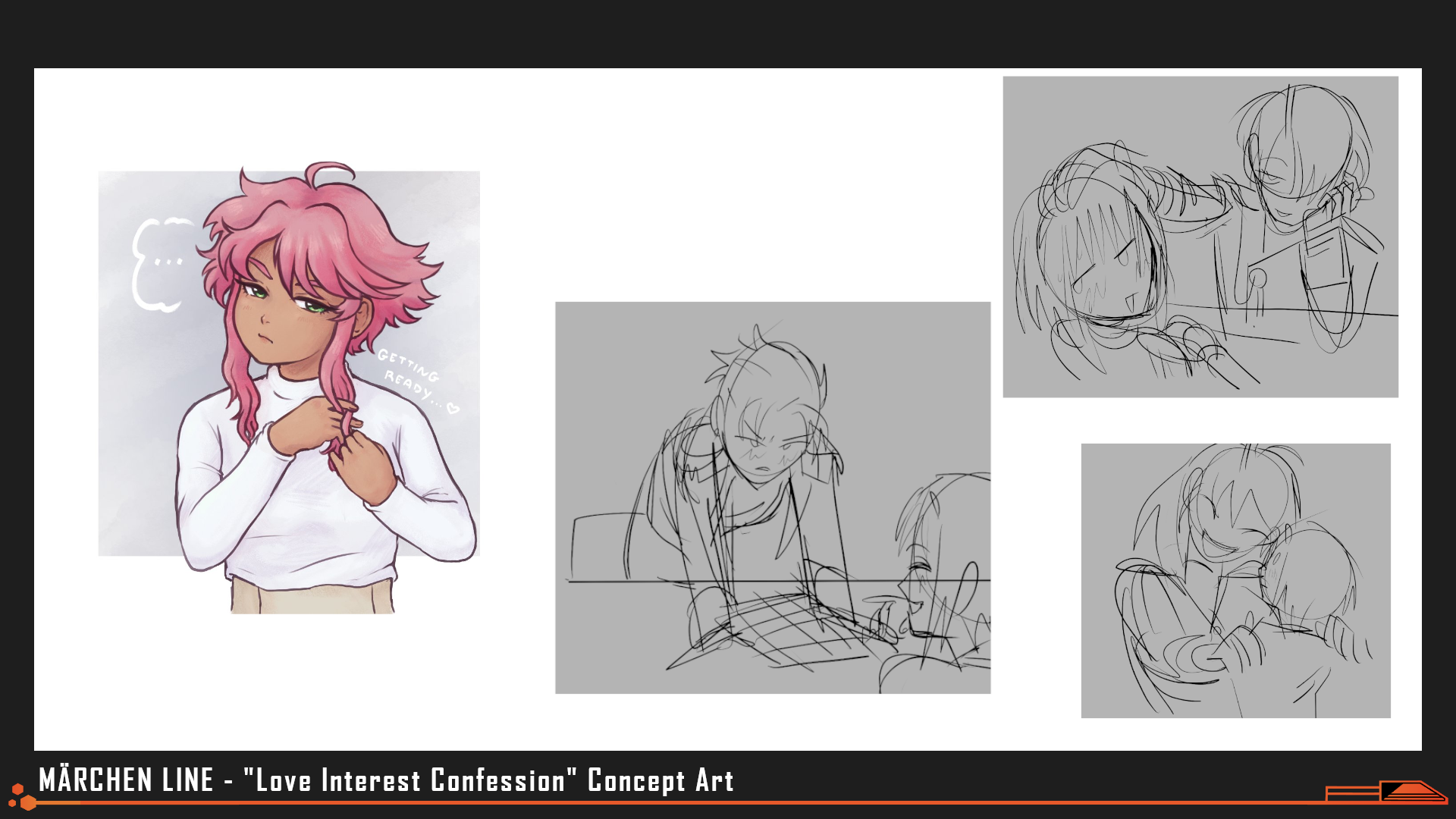
Art by fawnedness, evillittlebug
Concept art for various "confession" scenes- ideas for which varied from kisses to dances to friendly embraces. Khara can be seen here working on those intricate braids of hers.
"Khara was originally envisioned as a tsundere character, cold on the outside and begrudgingly accepting her interest in the protagonist. When writing Khara’s route, I drew heavily from what I find appealing about the “Villainess” genre of stories, which often show the story of an otome game or fantasy novel from the point of view of the female antagonist. The Villainess is usually a character that is portrayed as spiteful or a bully, keeping her enemies in check and her maids on a tight leash. These stories often explore the choices a Villainess has made in order to survive in a society with a strict familial hierarchy and dangerous consequences for perceived weakness. This concept gave Khara a reason to show both initial interest and dislike for Corsica–having lived her whole life under the weight of her family’s expectations, she has little respect for their choice to leave their family."
"During her storyline, Khara reluctantly acknowledges the protagonist’s usefulness, resilience, and eventually their optimism and determination. She is the only character with a branching path, and the only character with a choice to test how closely you’ve been reading. Her endings are “Universe’s strongest right hand” and “All things in their places.” Being by Khara’s side is all or nothing–love and trust is nothing to her without loyalty, devotion, and a promise."
-Alter, Writing & Concept Art
Stats as Gameplay and Story
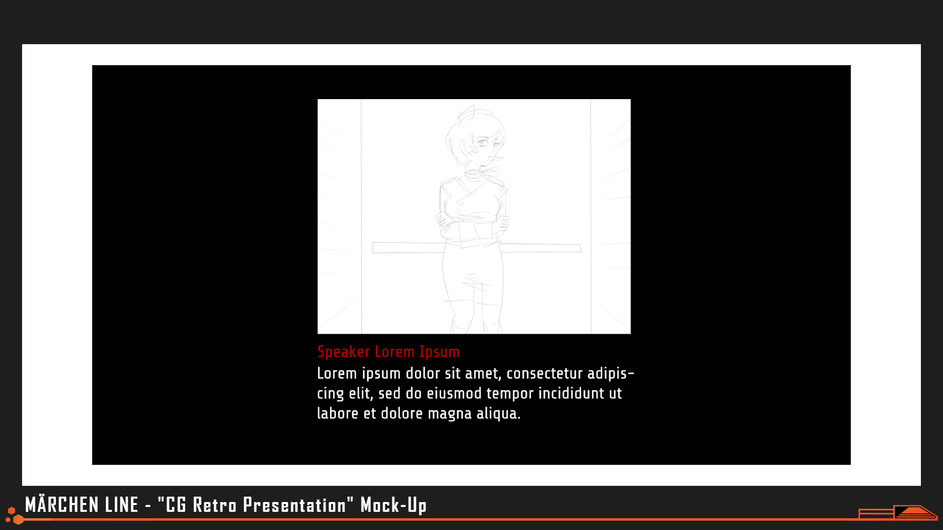
Mock-Up by evillittlebug
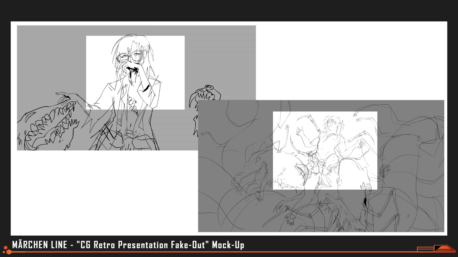
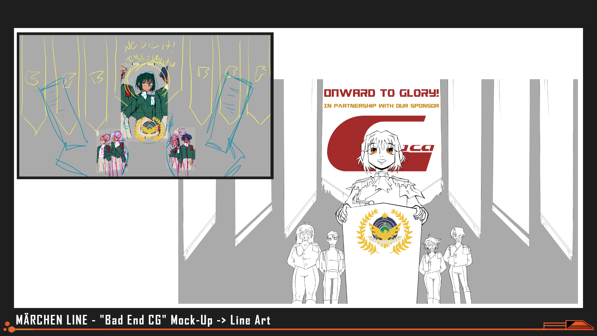
Wanting to give our CGs something unique, we opted for a tightly cropped 4:3 aspect ratio that resembled how cutscenes were often presented in PC-98 adventure games and RPGS.
Because the combat system ended up being so simple, stats that players raise in order to pursue romantic interests didn't have much use throughout the rest of the game. In part, this worked thematically- having a player's "training" end up being useless and/or unnecessary in the face of the intergalactic war machine was poignant. But we also wanted to reward players for diversifying their stat spread and introduce a little personalization to each of their playthroughs.
Art by evillittlebug
We played with the idea of using the 4:3 cropping to initially "hide" details of some CGs but ultimately reserved this effect for Artemis' stab incident, to make it as surprising as possible.
With little additional coding required, we created a "Stat-Check" system for dialogue wherein having stats above certain levels would trigger different lines of dialogue. It added variety and flavor to a number of conversations throughout the script and helped make players feel like they were making the right (or wrong) use of their time. (As somewhat of an Easter Egg, there are no Strength checks aside from the initial exercises on the first day. Having very big muscles doesn't help much during small talk.)
Art by beecusp, evillittlebug
But we then had the opportunity to subvert that stat check system to add more weight to the game's themes and story- frontloading the player with impossible to succeed level 1 stat checks at the start of the script to make them feel helpless and unprepared and eager to start growing. We could then slowly build up their confidence in their training throughout the story, letting them succeed at gradually more difficult stat checks...before pulling the rug out from them entirely during the final act, introducing stat checks at levels they weren't even aware existed.
The impossible nature of these "false" stat checks then helped prepare the player mentally for the sacrifice that would be asked of them in the True End and the only "solution" available to them to beat Father: refusing to play his game.
Making a Monster
Art by ilmenskie, evillittlebug
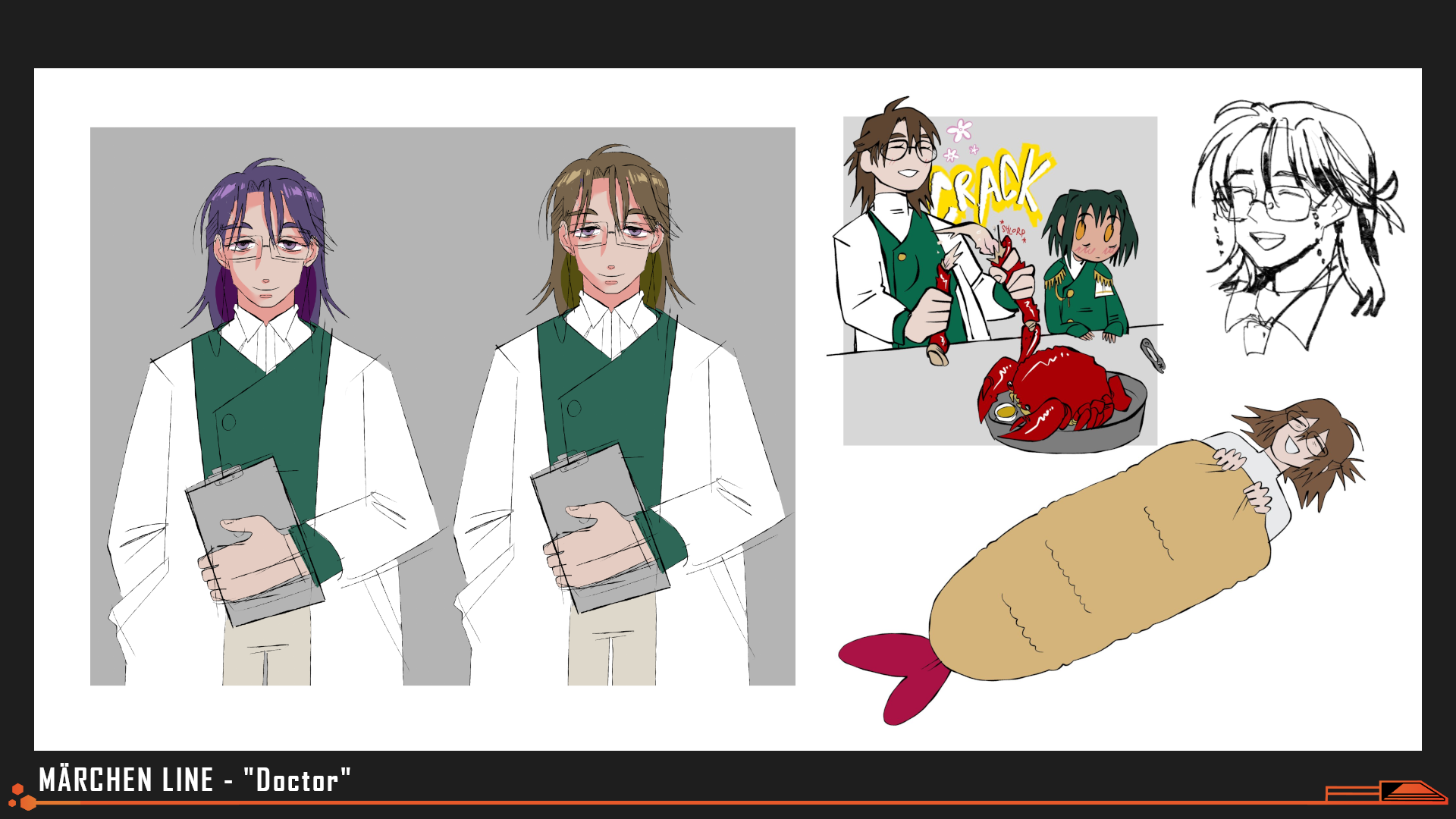
Doctor's name went through more revisions than any other character. Adrien Vaultr was ultimately chosen for the balance between the soft, curved look of his first name and the harsh, warrior-like intonation of his family name. Born any other time in history, he'd have made for a ferocious warrior.
Early on in planning we knew we wanted to push ourselves with visuals for this jam, and we saw our "final boss" as the perfect opportunity to do so. Throughout the rest of the story we had to make our limitations work for us- obscuring violence and bloodshed with pixelated censors to "cover-up" our limited number of unique art assets while also placing the audience in the shoes of an infantilized soldier. For "Caterpillar," we wanted to go big.
Art by ilmenskie, evillittlebug
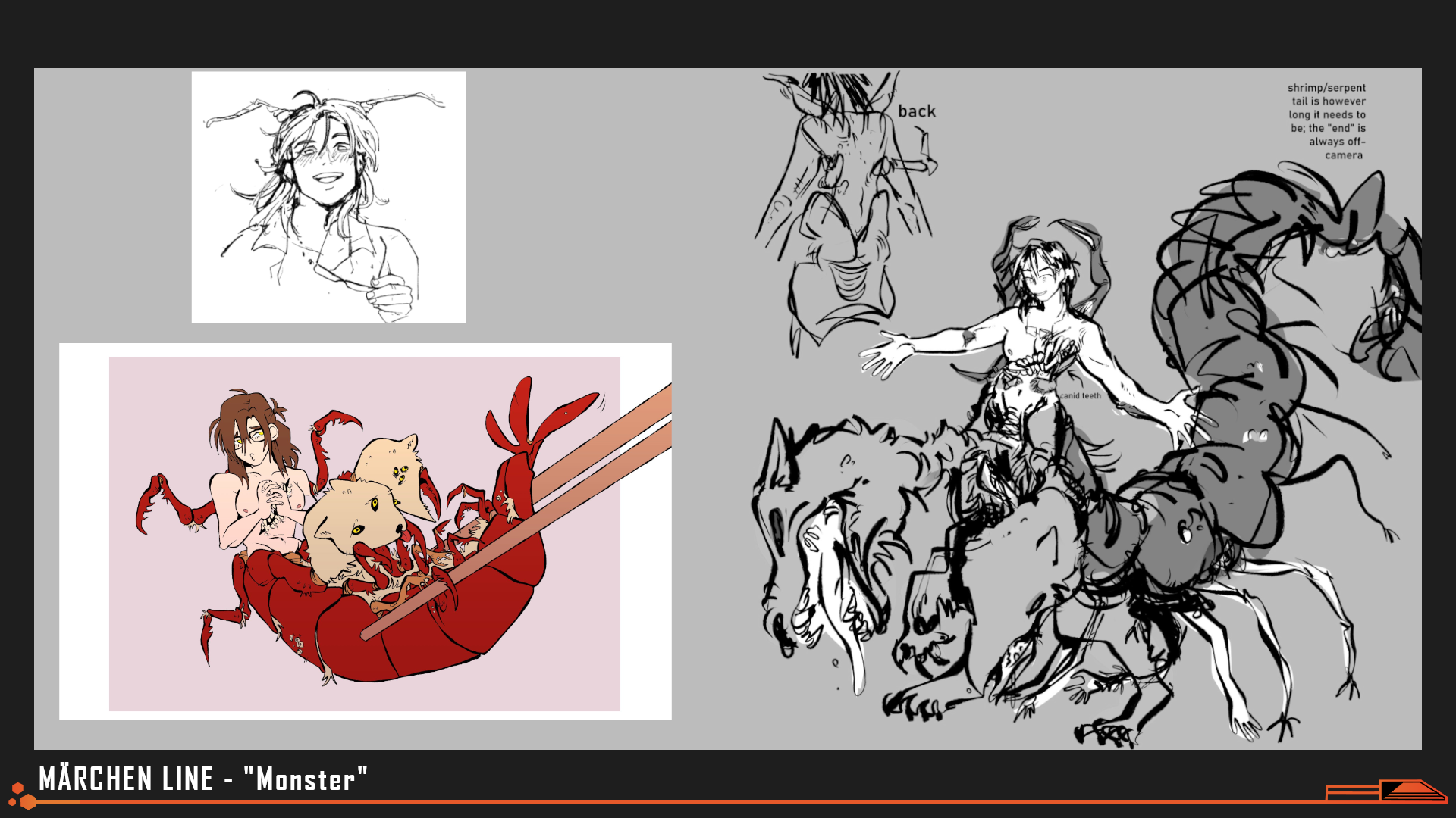
Initially the monster confronted at the end of the True Route was a wolf-snake-hybrid chimera; "Fenrir and Jormungandr" come to end the reign of Odin. When we started designing our aliens with crabs in mind, we then sought to add more crab-like features to Adrien's transformation, to demonstrate thematically how thin the line between Cancer and Homo Caelum really was. Crab + Snake made Centipede... and the wolf came back as lobster-like snapping claws. The name "Caterpillar" was chosen to fit the theme of metamorphosis and a "Slow-starter"- we then worked backwards to seed reasons why his past squadmates might've chosen such a callsign.
After his design was finalized, his sprite was cut up into sections- one for each "bone" of every limb we wanted to animate. Inside Unity, "hand" was then attached to "wrist" which was then attached to "forearm" and so and so forth, so that as each "joint" rotated or shifted, all the pieces downhill from it would move as well.
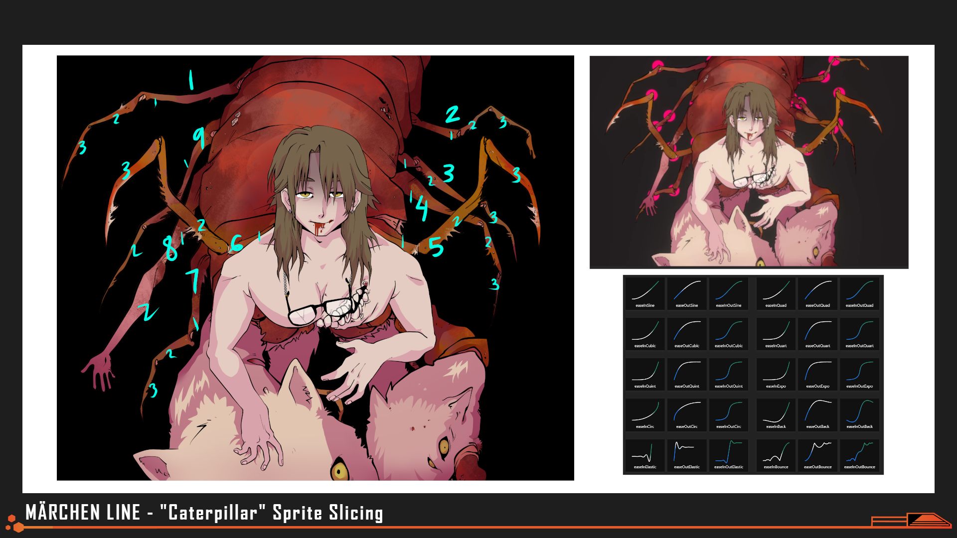
Sprite Art by ilmenskie, fawnedness, evillittlebug
Caterpillar's body ended up sliced into over 30 different sprites, not counting his various facial expressions.
While the final product might look organic and complex, each individual "joint" has a relatively simple animation loop attached to it, driven by simple math. By utilizing a variety of "eases" (sometimes known as animation curves), and having each "joint" "multiply" the complexity of all the movement of any sprites attached to them, we were able to achieve a remarkably organic, "insect-like" feel for Caterpillar despite our team's limited experience with traditional animation.
What's Next for Nth Circle?
Nth Circle emerges from our second competitive game jam with our second ranking, remaining eager to prove ourselves to our audience and the visual novel community at large. Our next release will be the long-awaited, much-hyped "of the Devil - Episode 1"; the next in our series of episodic cyberpunk murder-mysteries and our first paid game. If you enjoy any of our works or have ever wanted to support us, please be sure to play the Episode 0 Demo, wishlist "of the Devil" on Steam and spread the word to all your friends about how excited you are to play Episode 1 when it comes out.
We'll also be looking to upgrade, clean-up, and port both Model Employee and Märchen Line to Steam in the coming months, as a way of thanking the community for engaging so earnestly with our work and in hopes of reaching an even wider audience. If you've encountered bugs or crashes, or have requests for quality of life features for either title, you can join our Discord as a bug-squasher to leave us your feedback.
Thank you for reading, and thank you, as always, for playing.
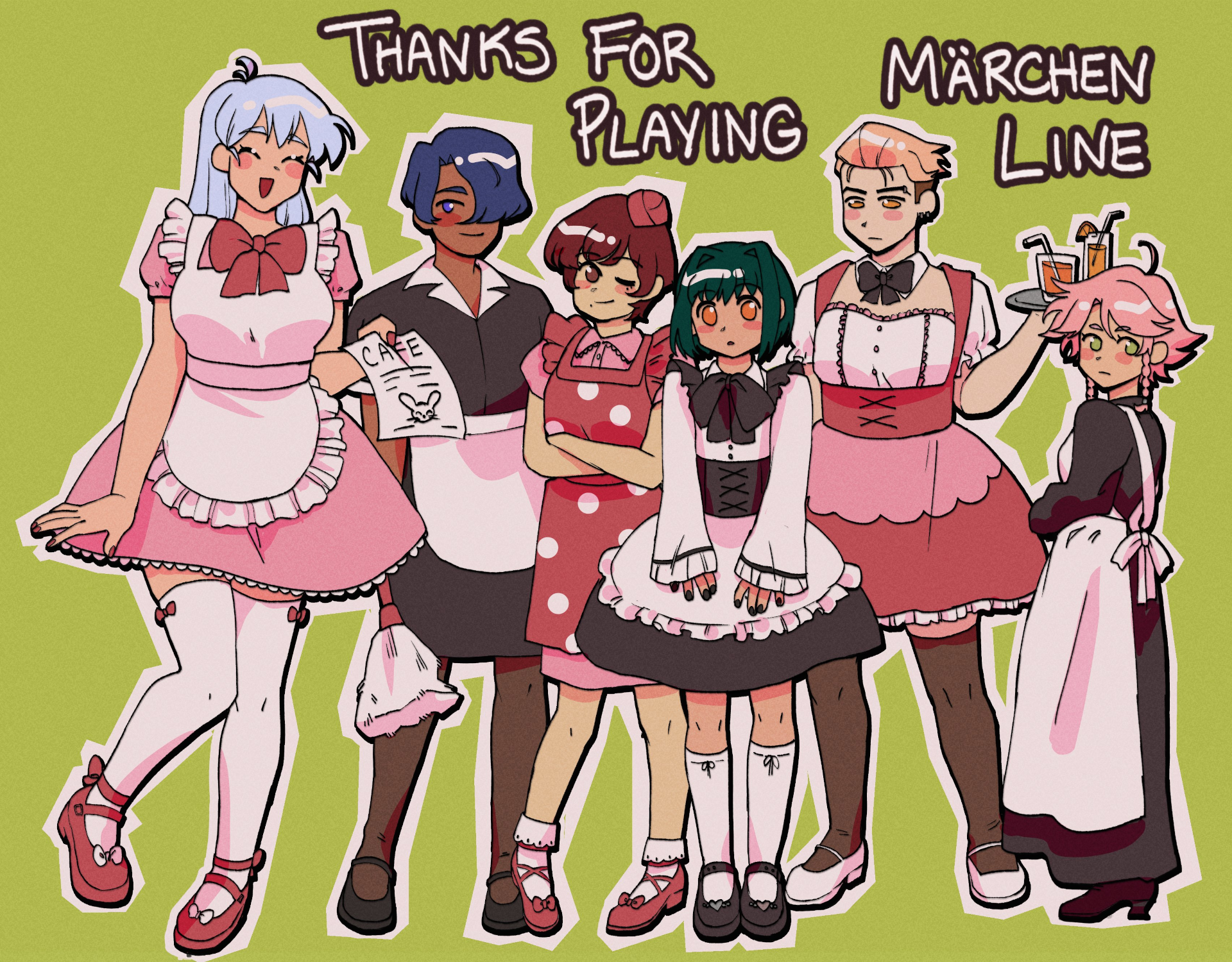
Art by ilmenskie
Get Märchen Line
Märchen Line
Dystopian Far-Future Military Dating Sim. "Soldiers Don't End Wars- They Fight Them."
| Status | Released |
| Author | Nth Circle |
| Genre | Visual Novel |
| Tags | Aliens, Anime, Dating Sim, Dystopian, Horror, Retro, Romance, Sci-fi, Space |
More posts
- Märchen Line 1.1.0 Now Available For MacOS & LinuxAug 03, 2025
- Märchen Line 1.1.0 Now Available For WindowsJul 26, 2025
- Märchen Line Bonus Video: What if you could ask ANYONE to the dance...?Oct 31, 2024
- Märchen Line Wins 2nd Place! ...And Patch 1.04Oct 31, 2024
- Patch 1.03 for Mac and Windows Now Available!Oct 13, 2024
- Patch 1.02Oct 10, 2024
- Märchen Line Now Available for MacOS!Oct 06, 2024
- Hotfix for 1.01Oct 03, 2024
- Märchen Line Patch 1.01Oct 03, 2024
Comments
Log in with itch.io to leave a comment.
Fascinating read! :D
What a cool peek behind the curtain for a very neat game. Thanks for sharing the writeup!